A deluxe copy of the legendary 1926 “Virgil” from the Cranach Press, printed on goatskin parchment and enriched with four additional suites with all woodcuts by Aristide Maillol
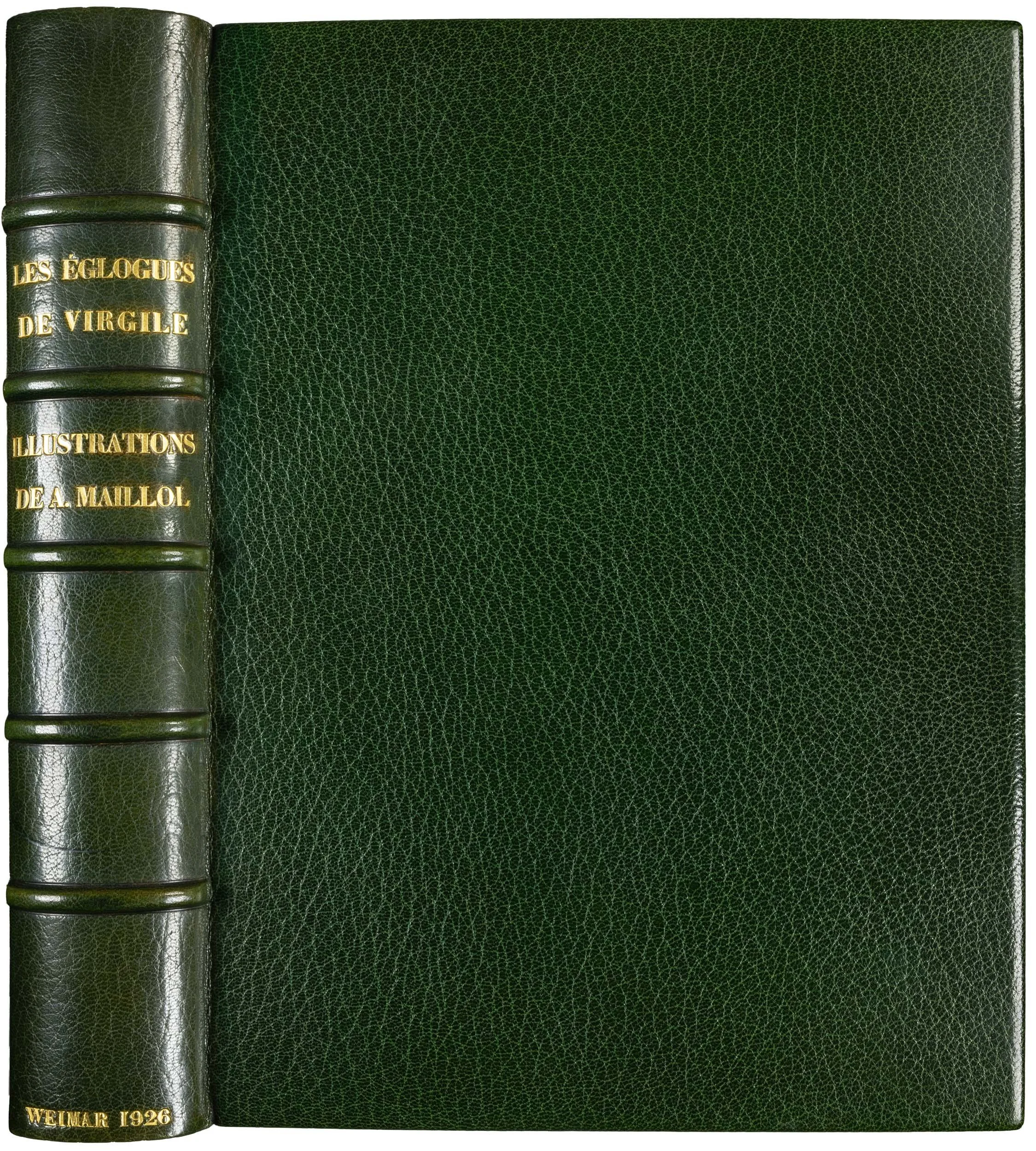
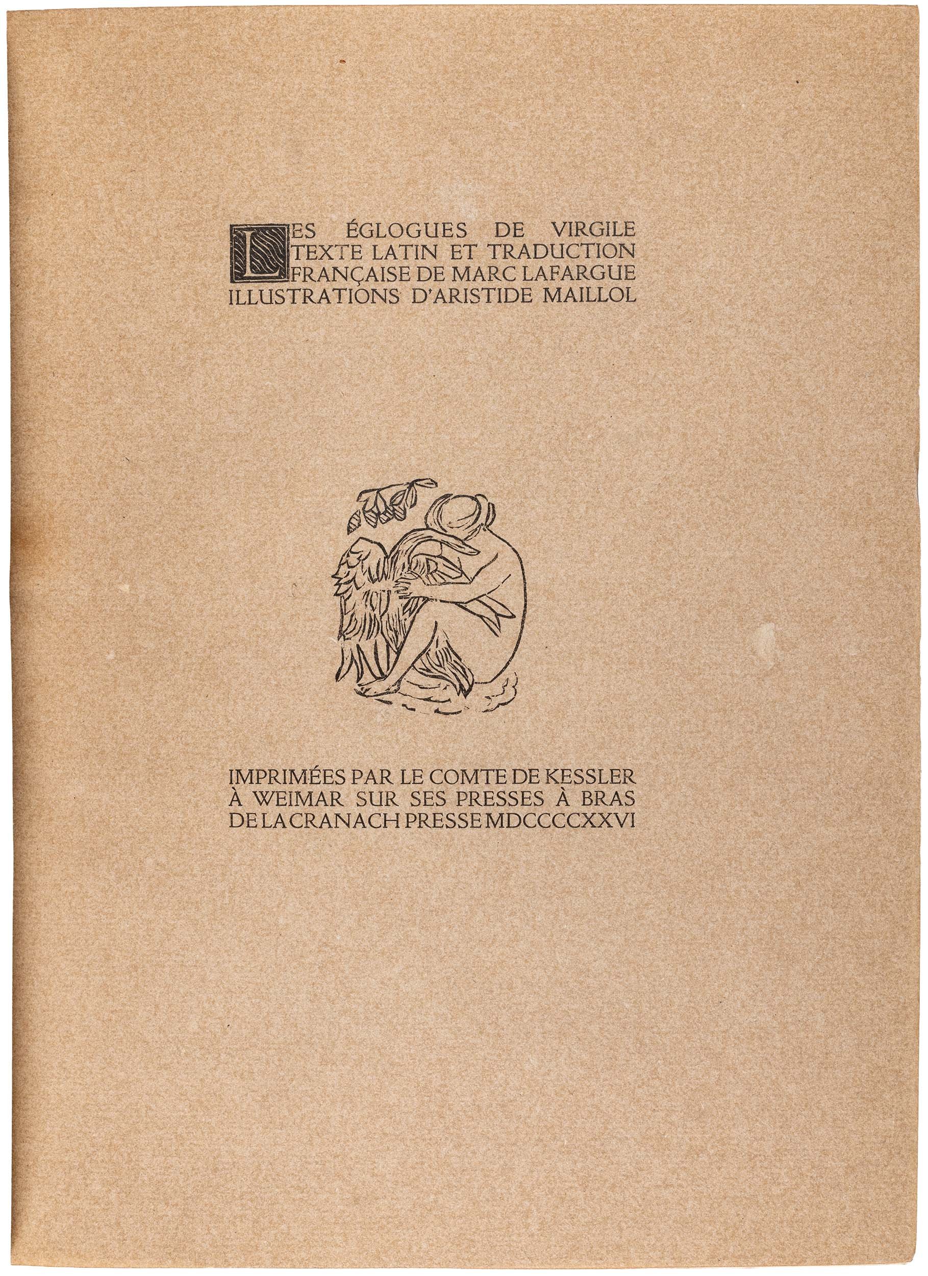
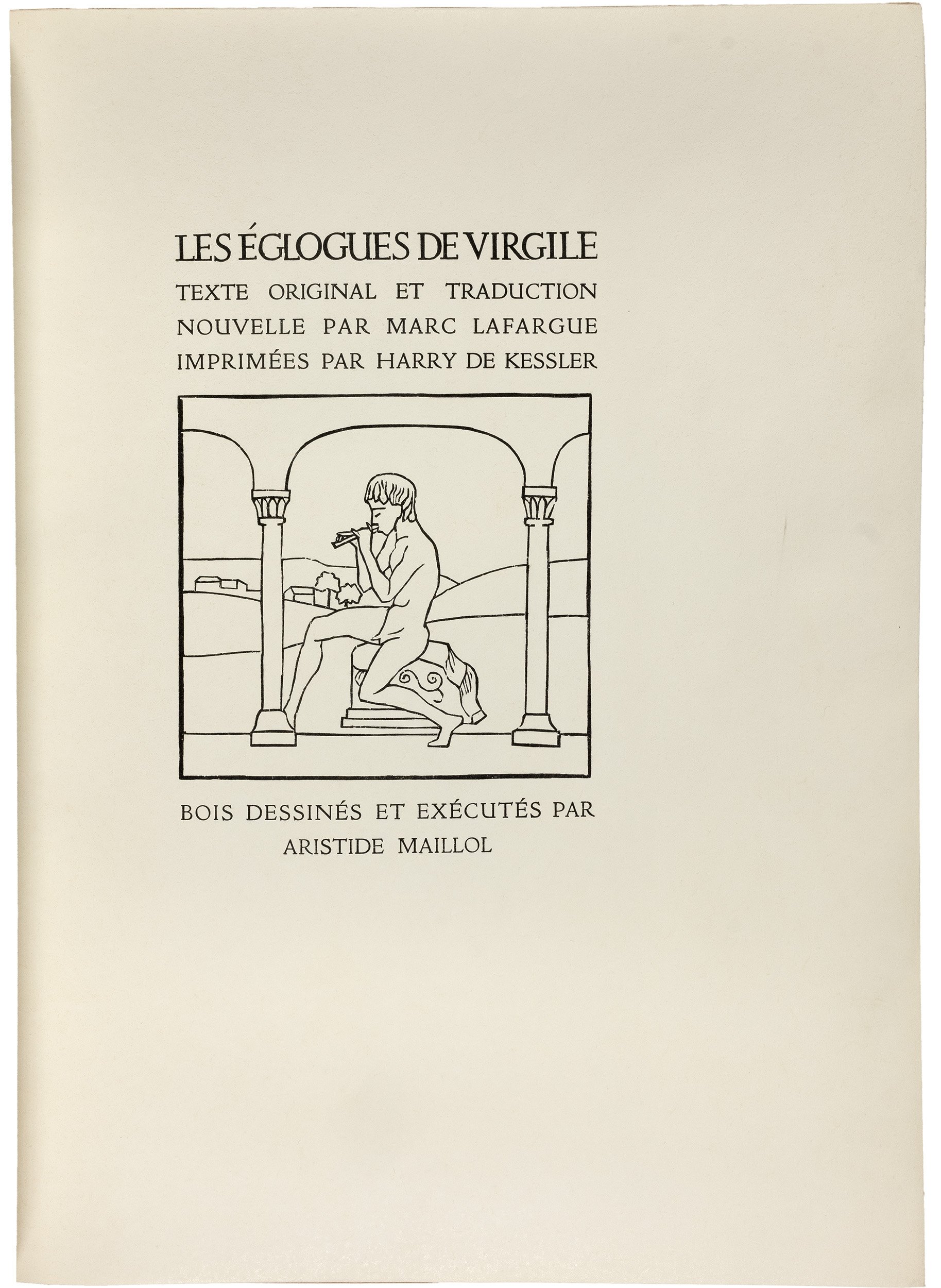
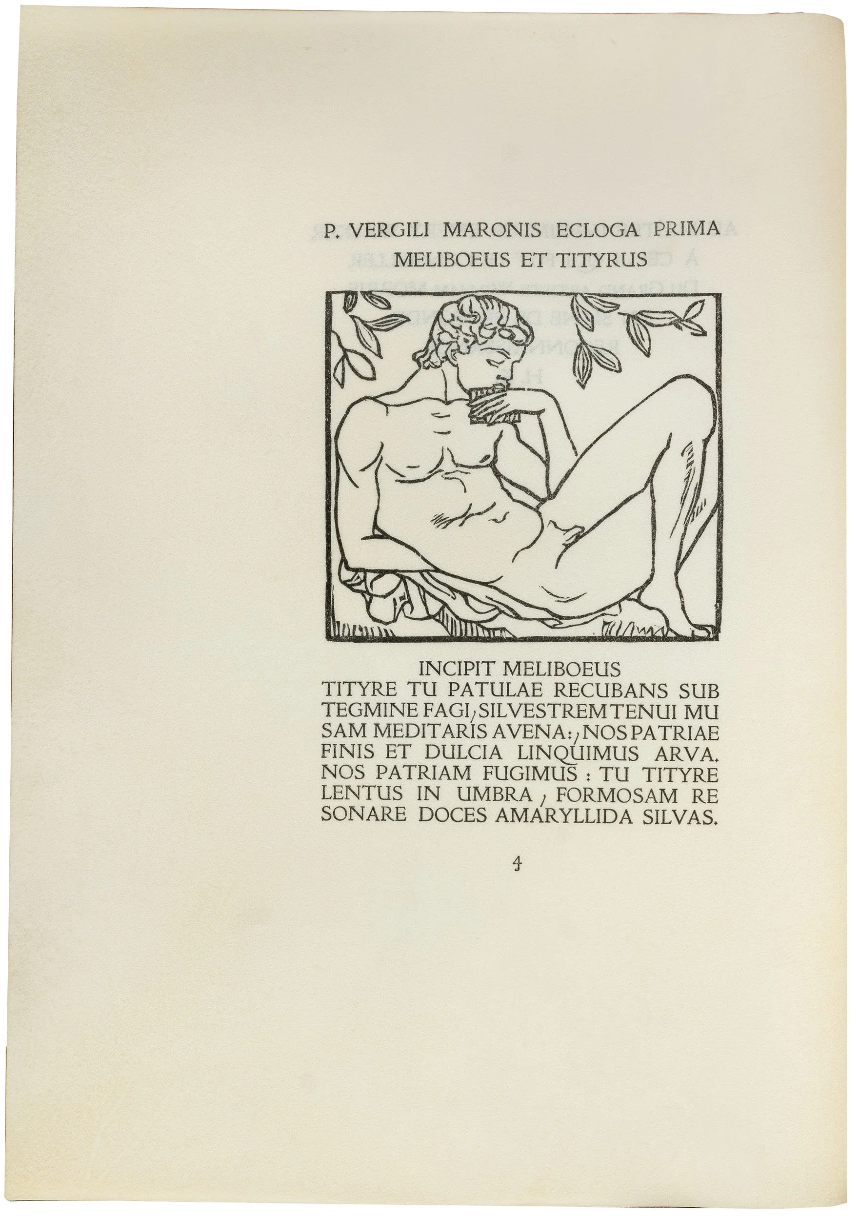
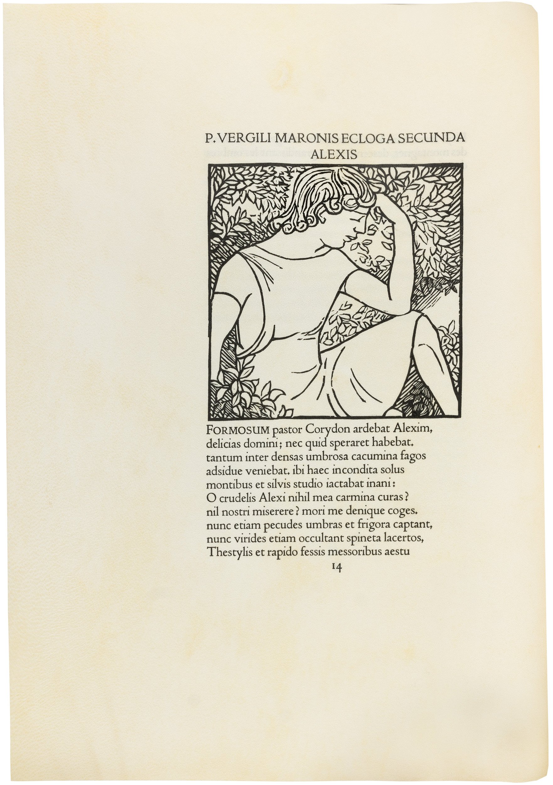
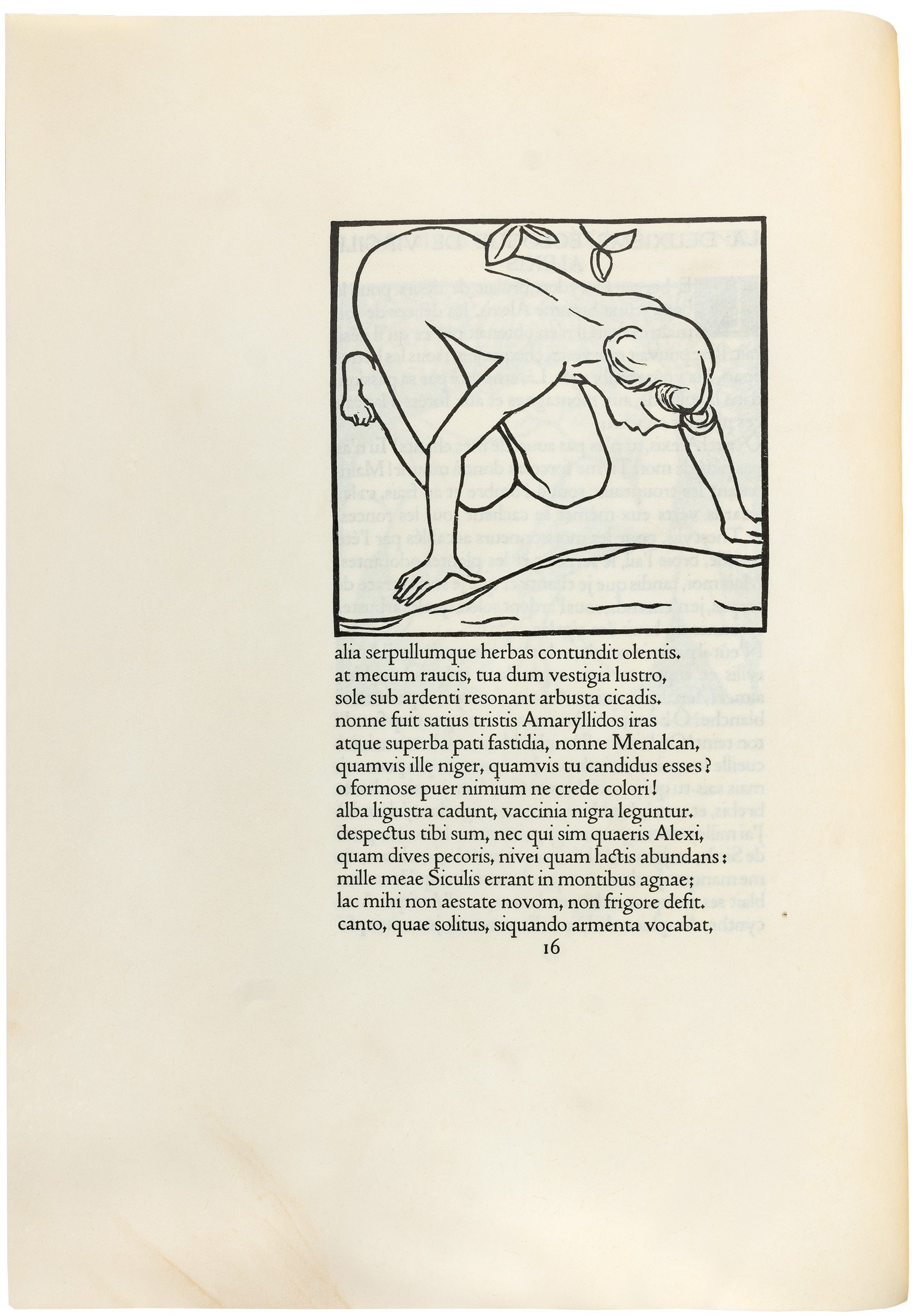
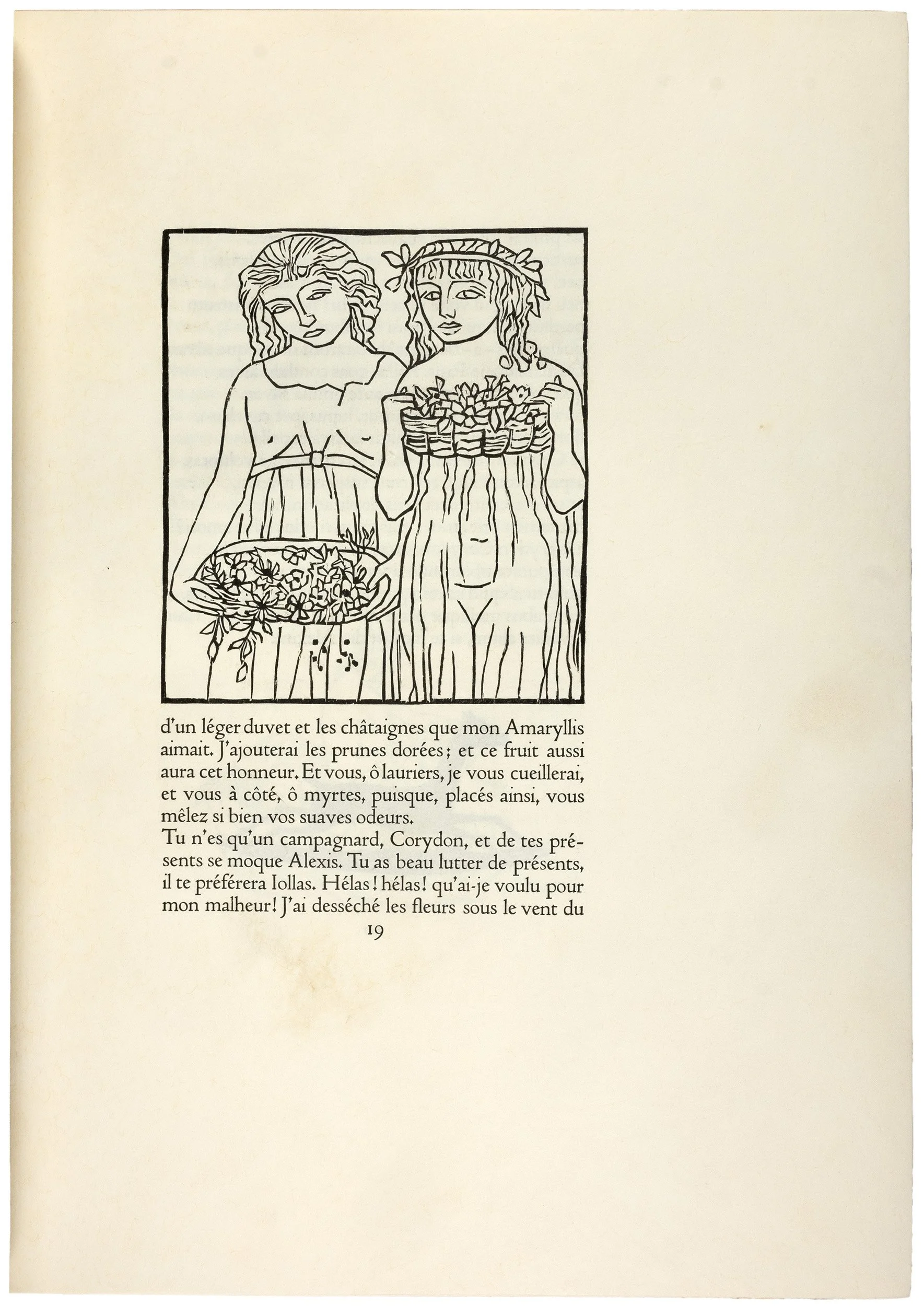
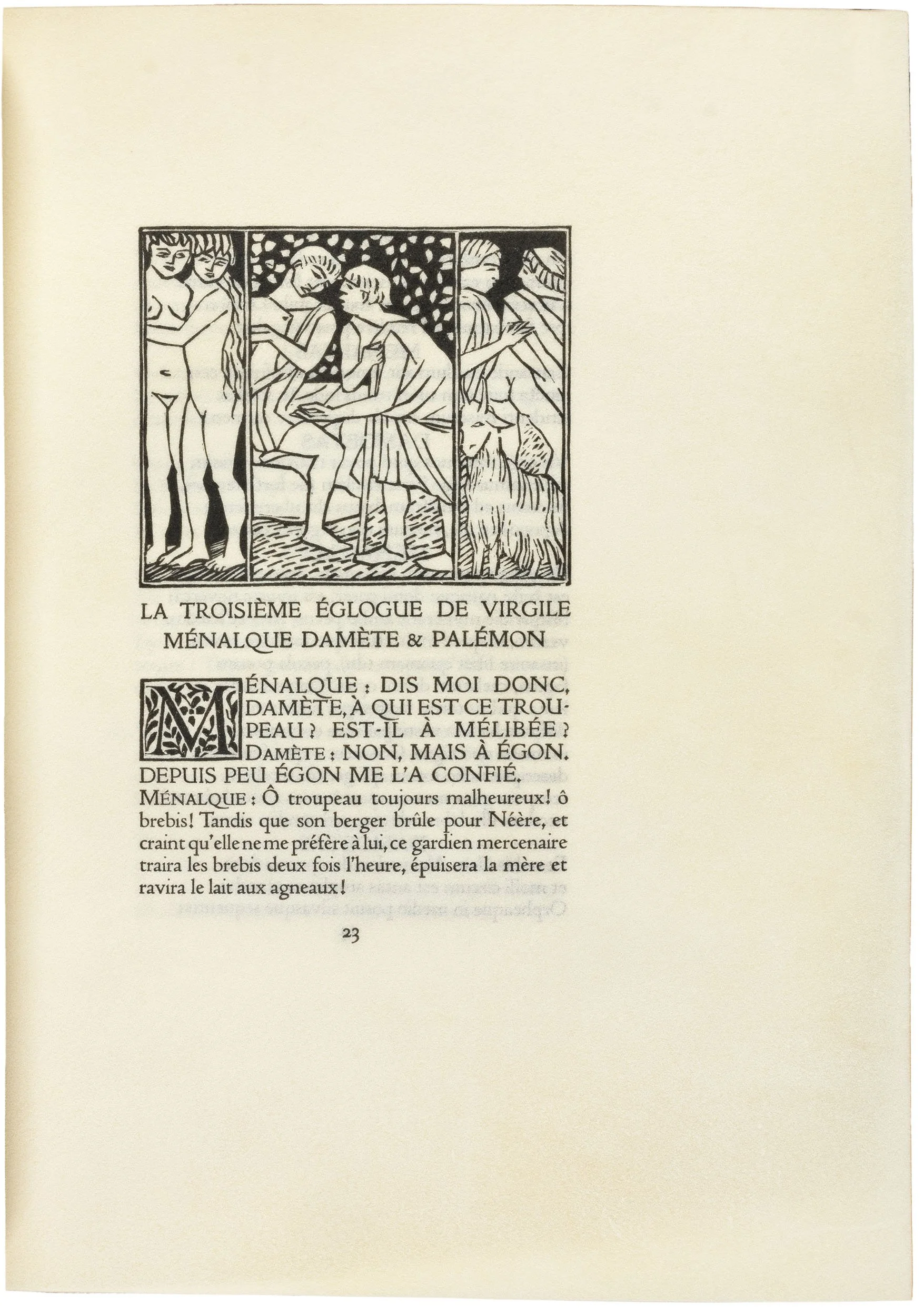
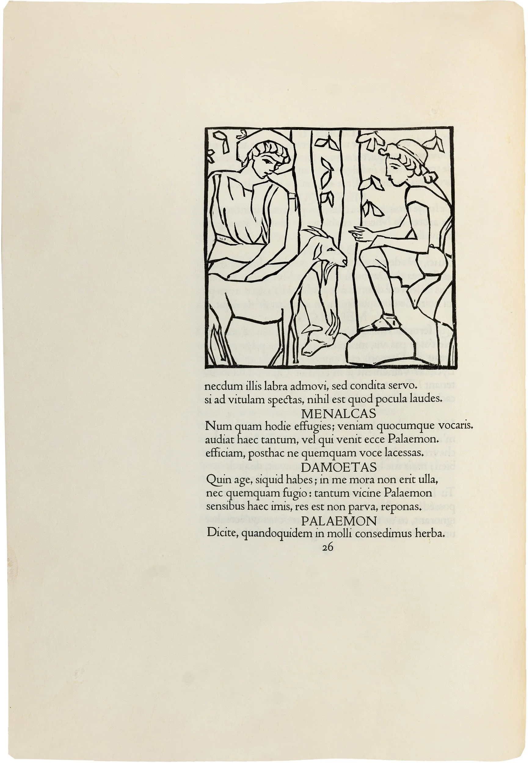
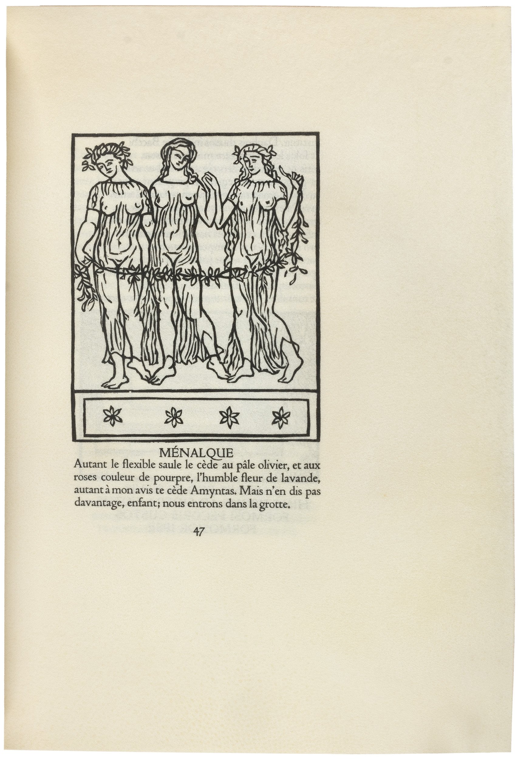
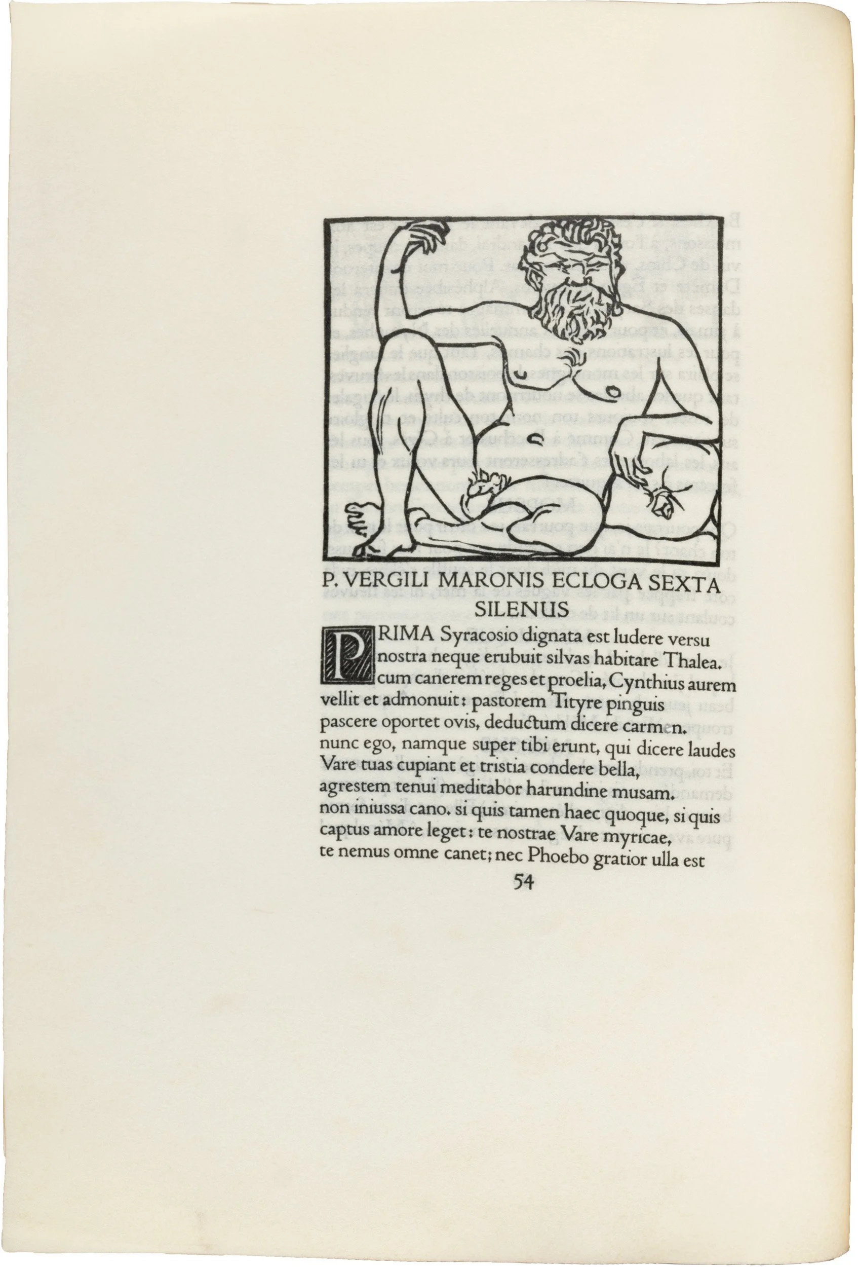
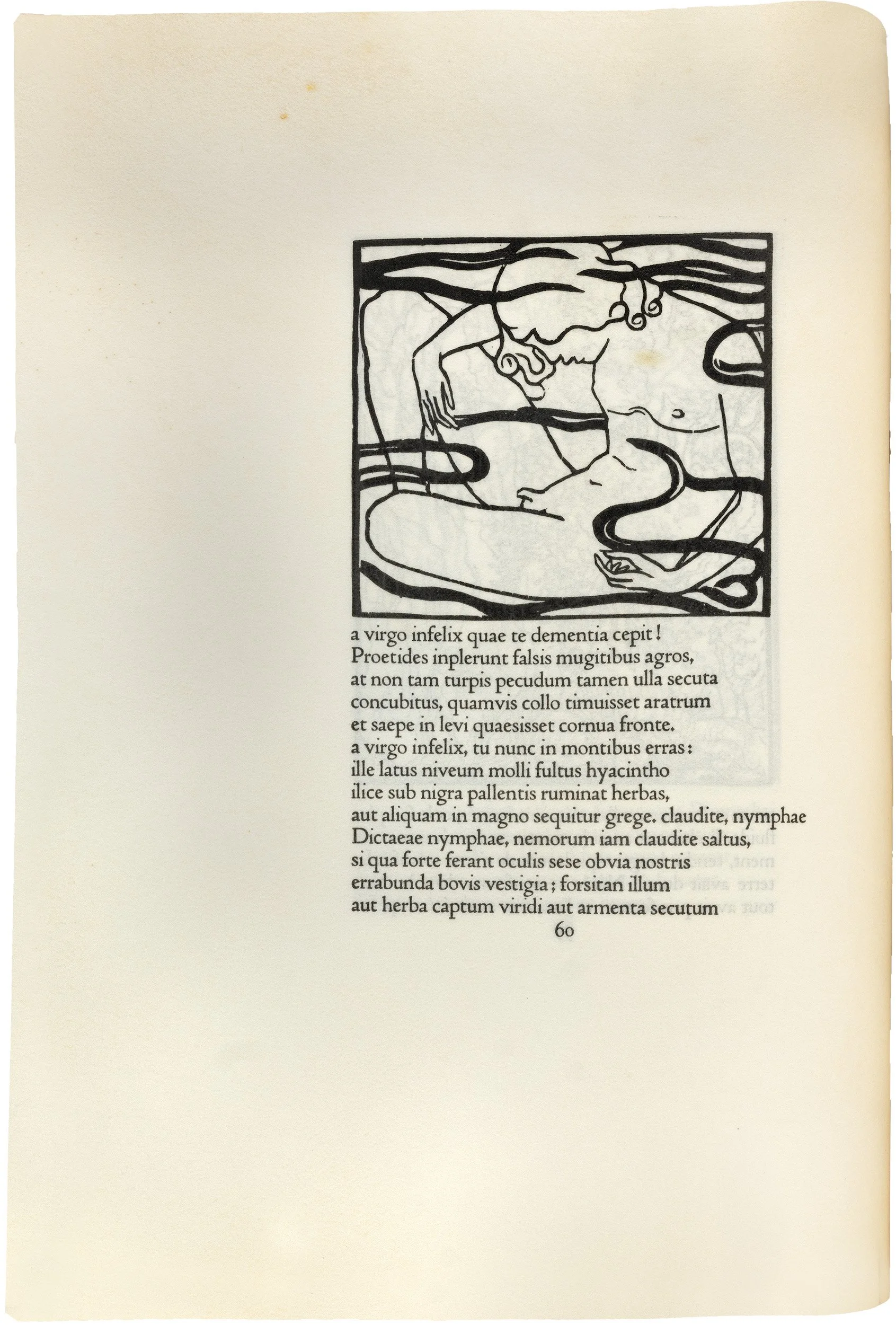
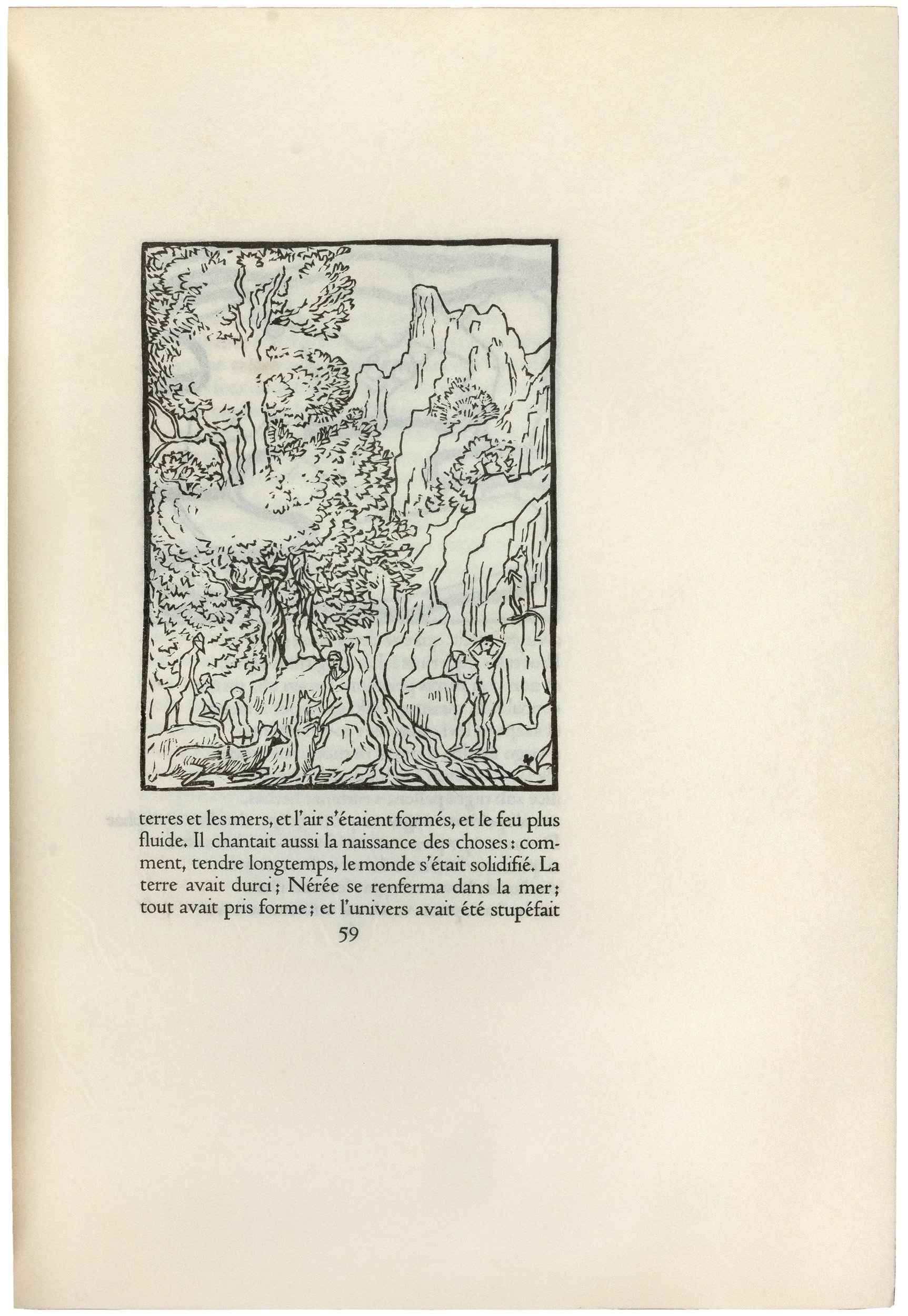
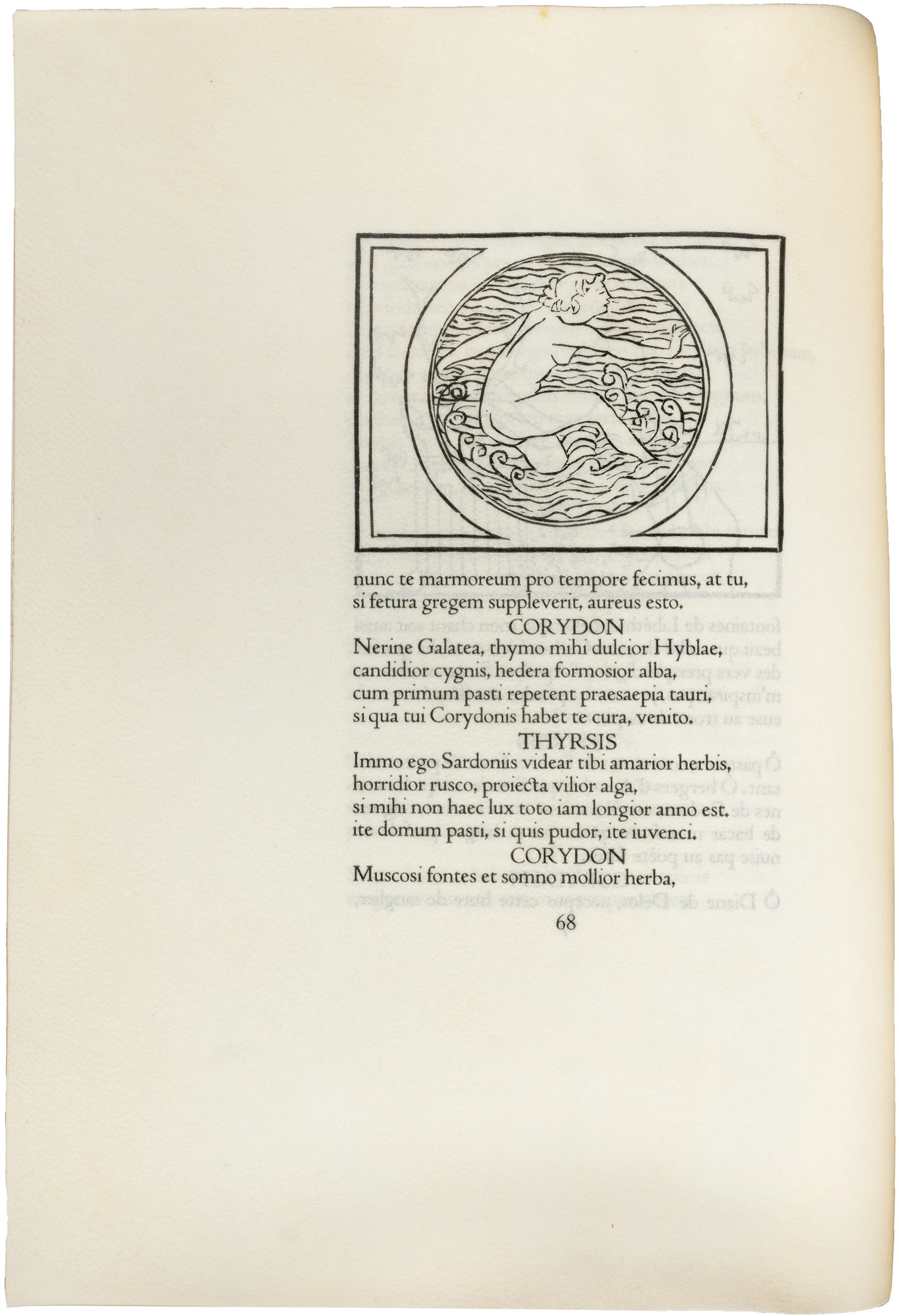
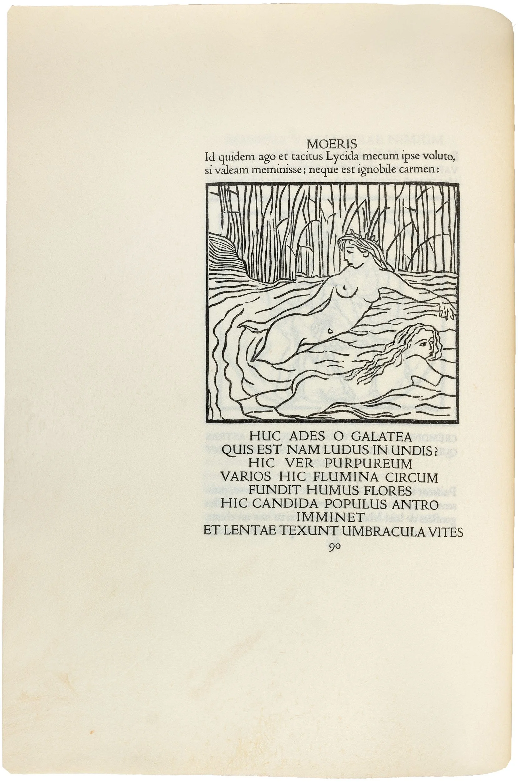
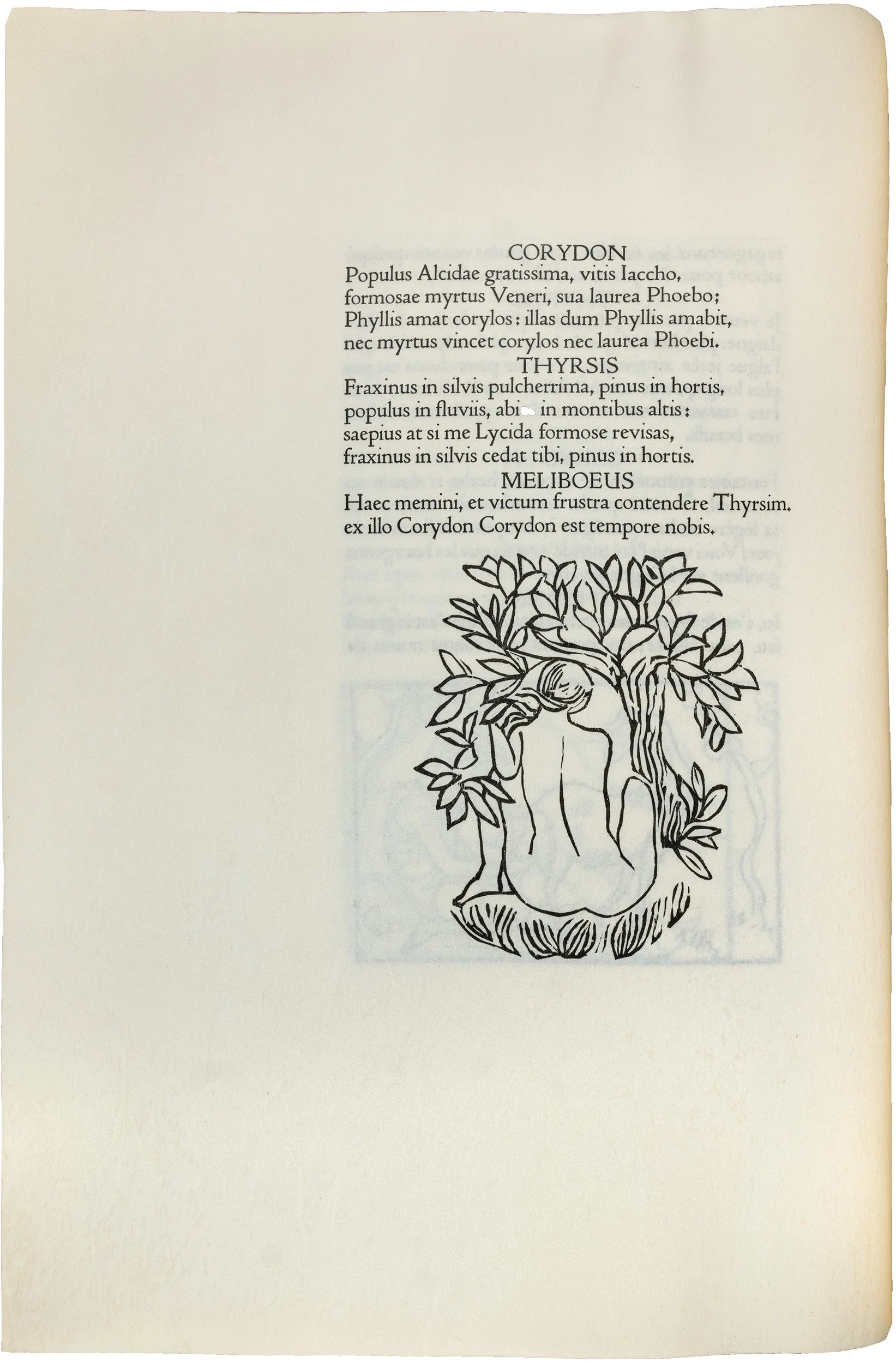
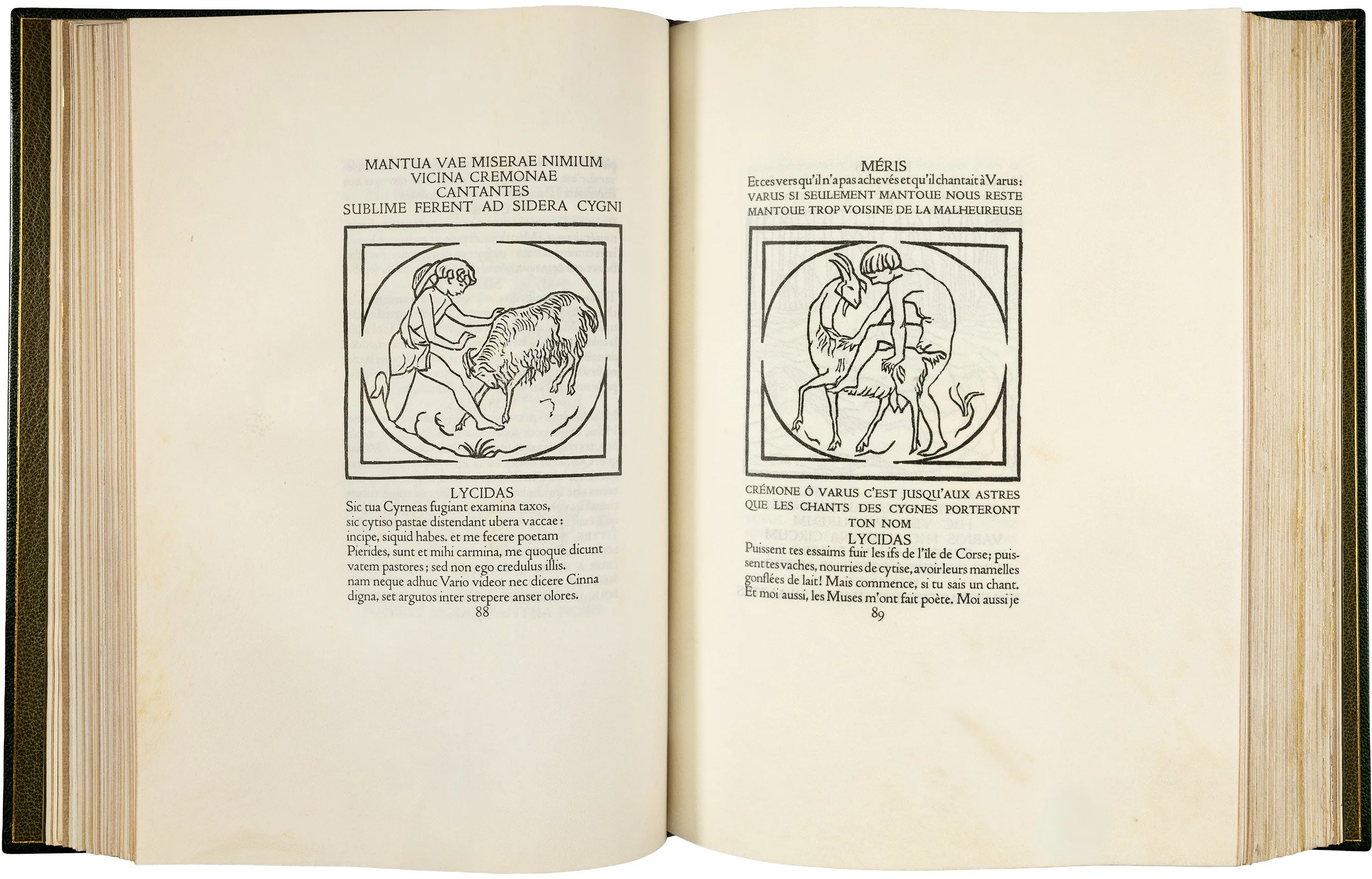
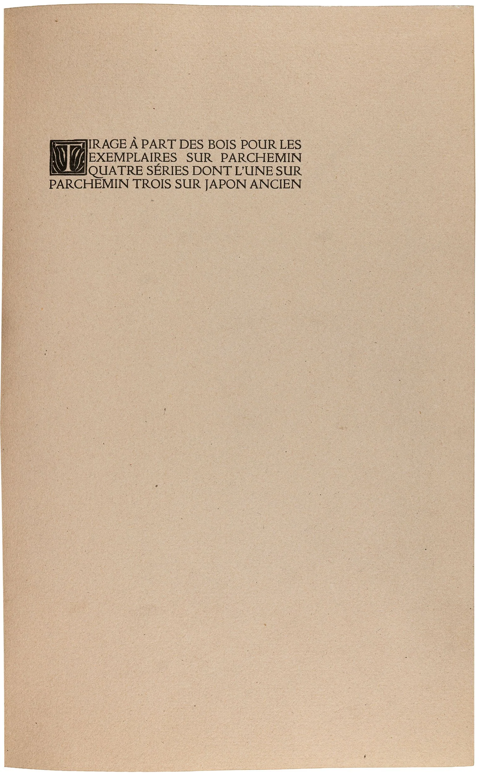
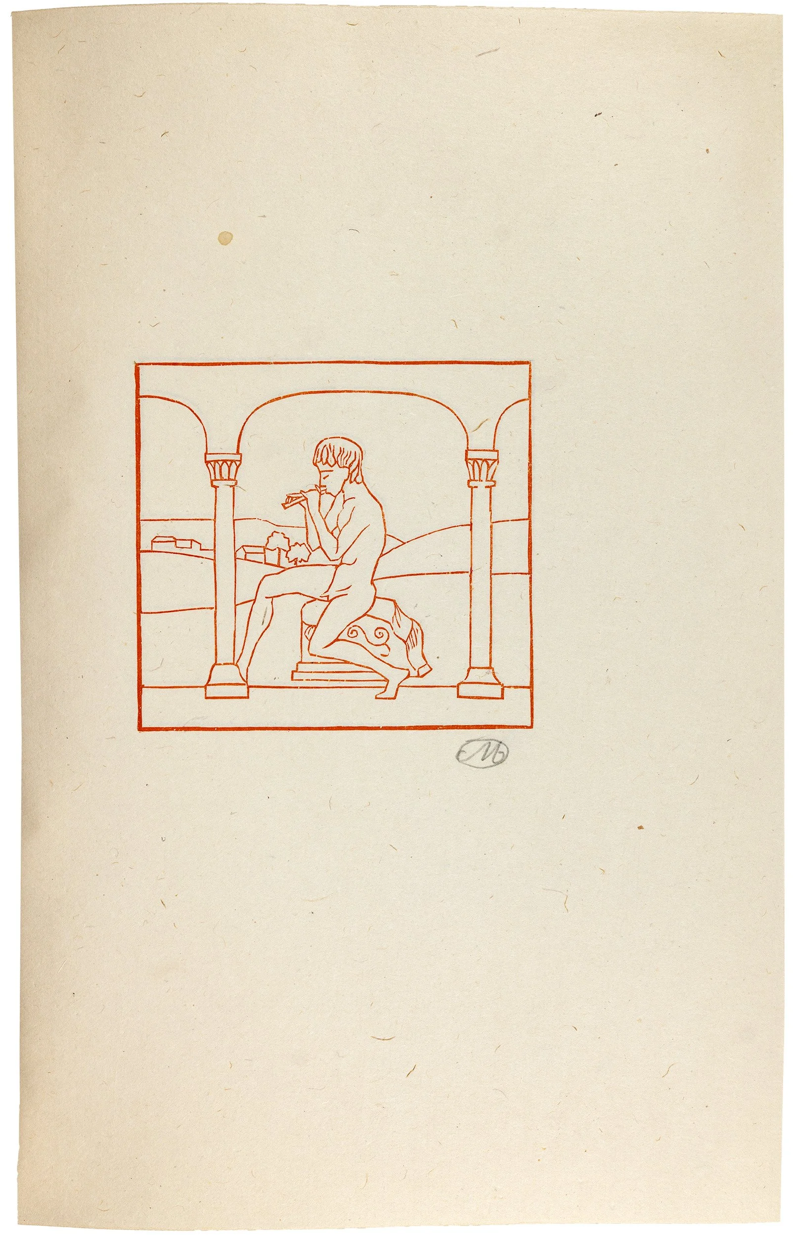
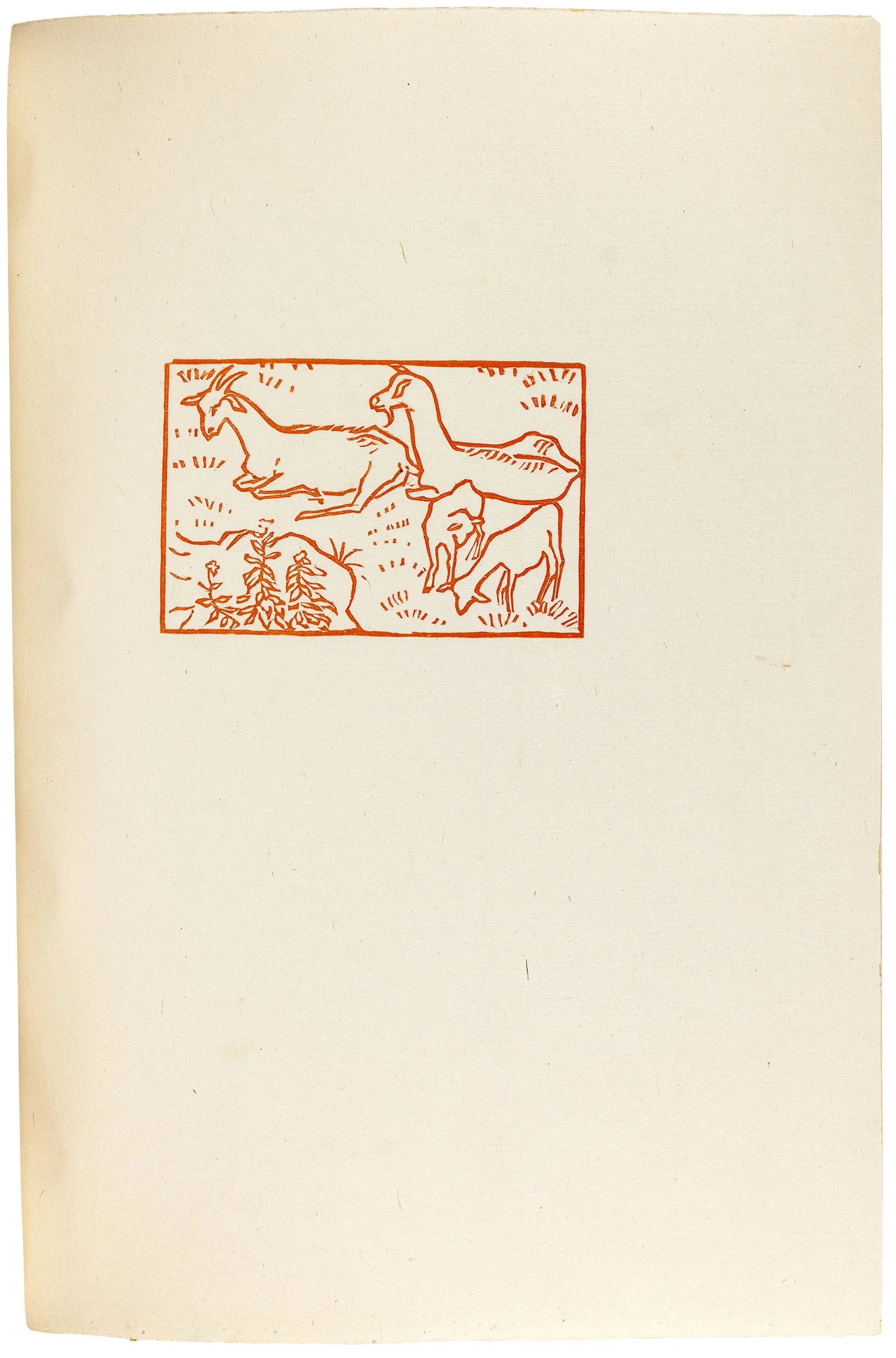
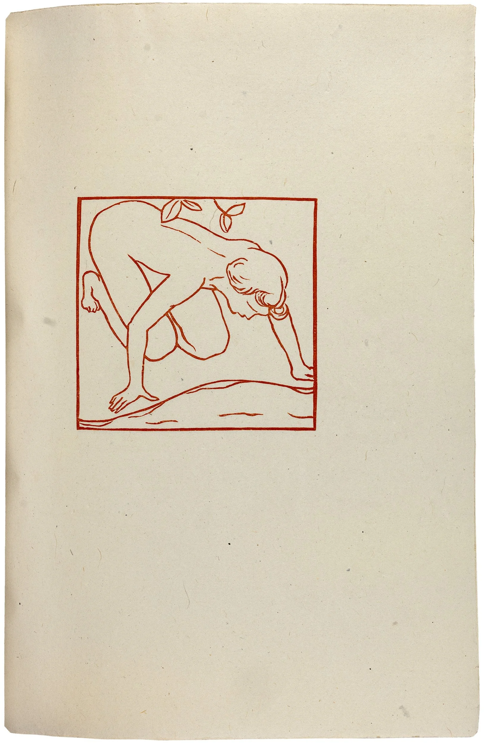
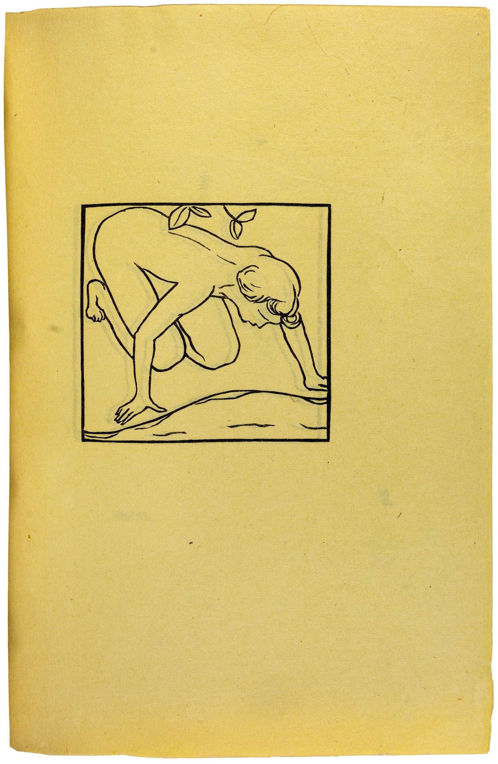
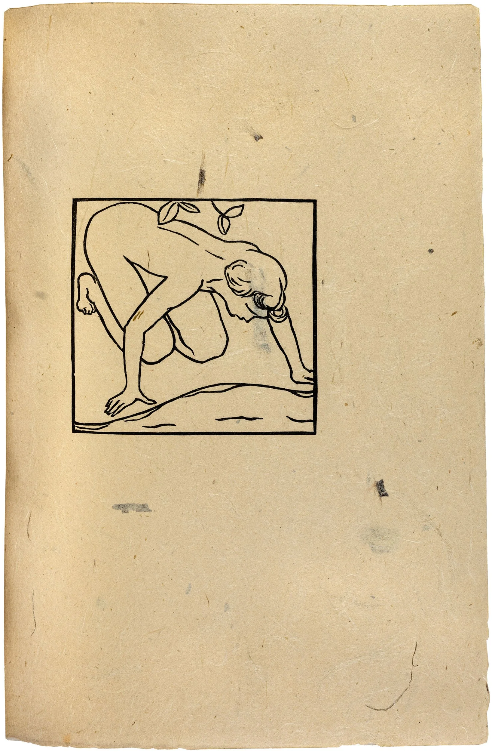
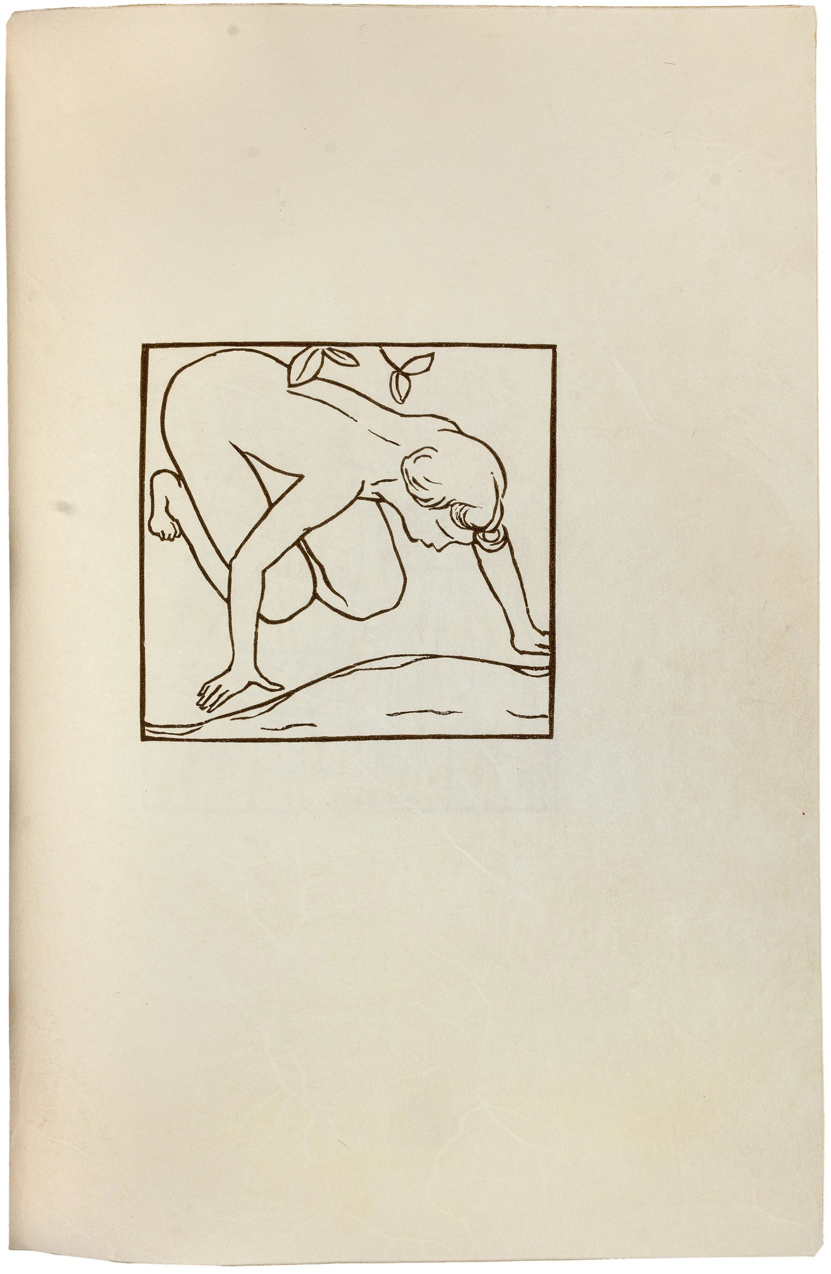
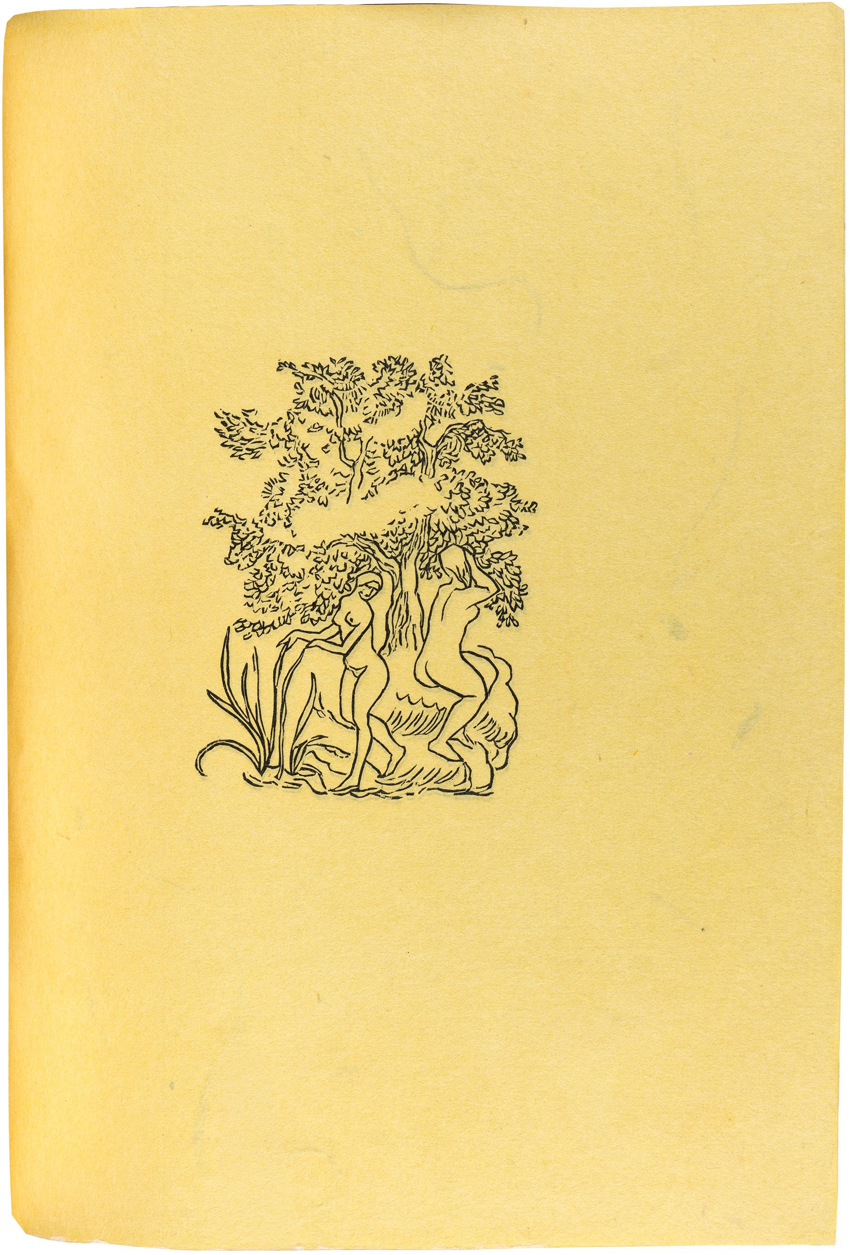
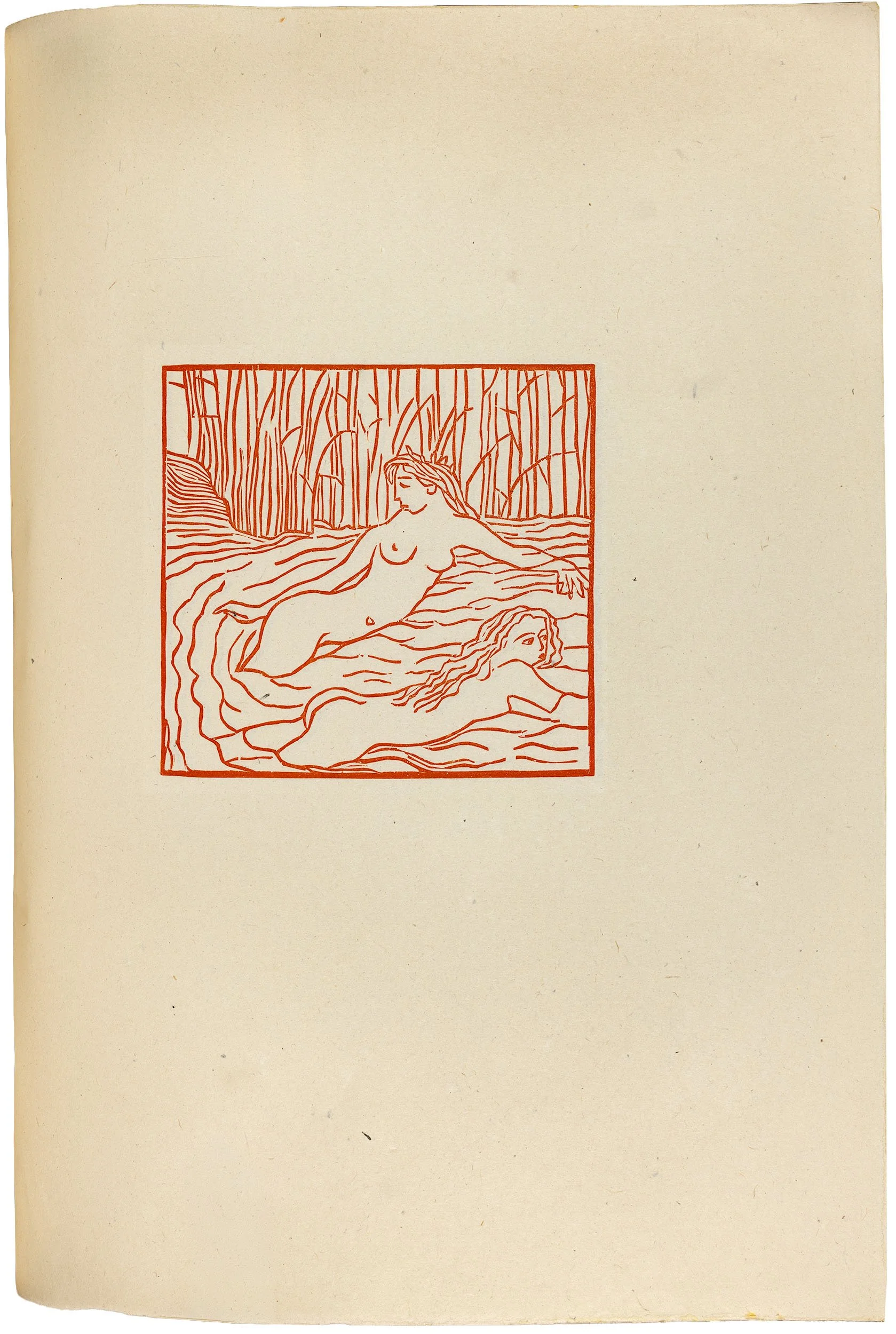
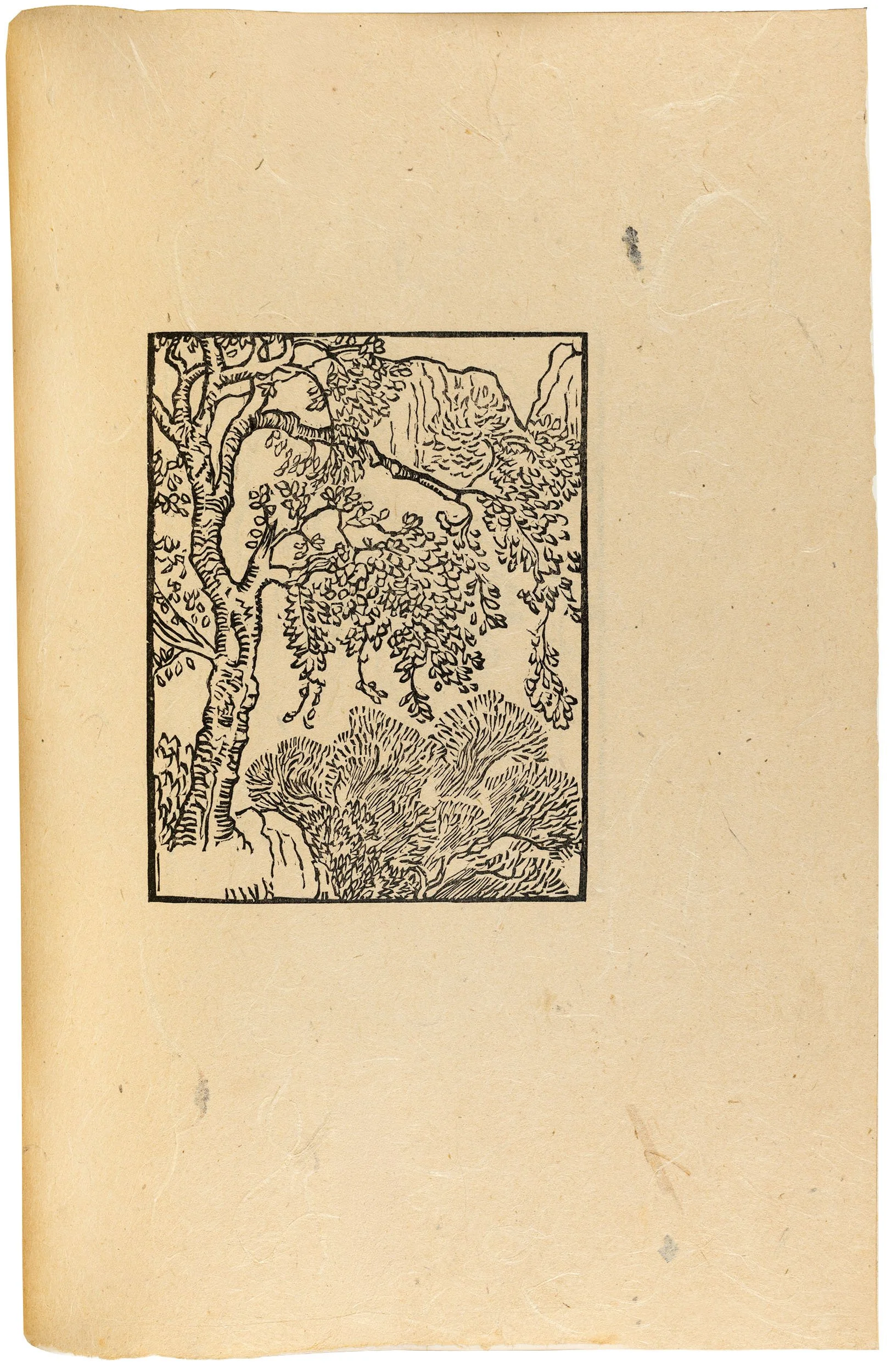
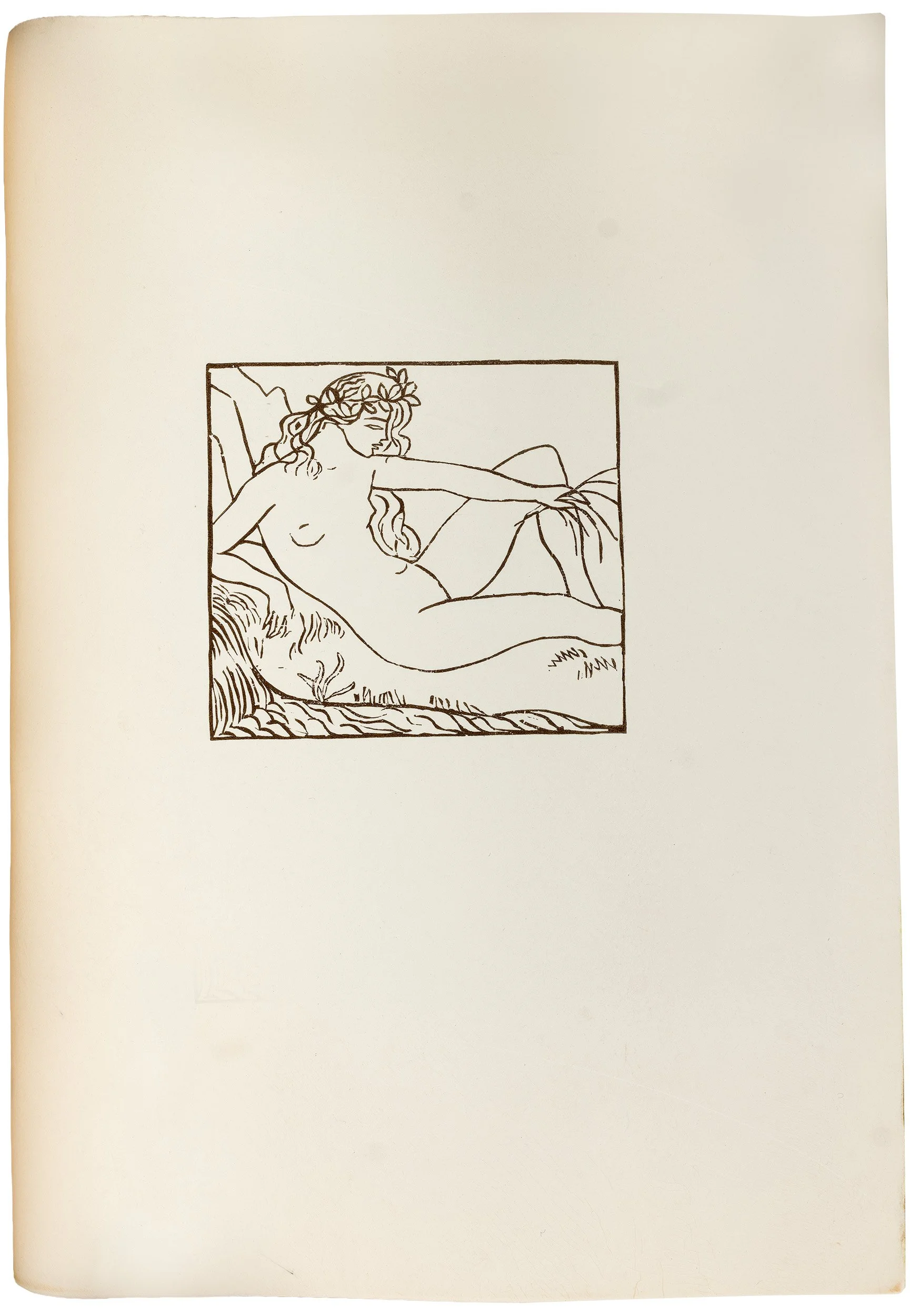
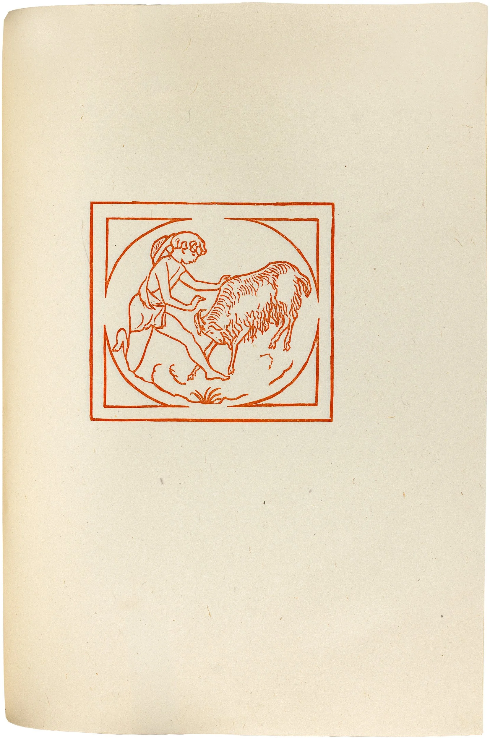
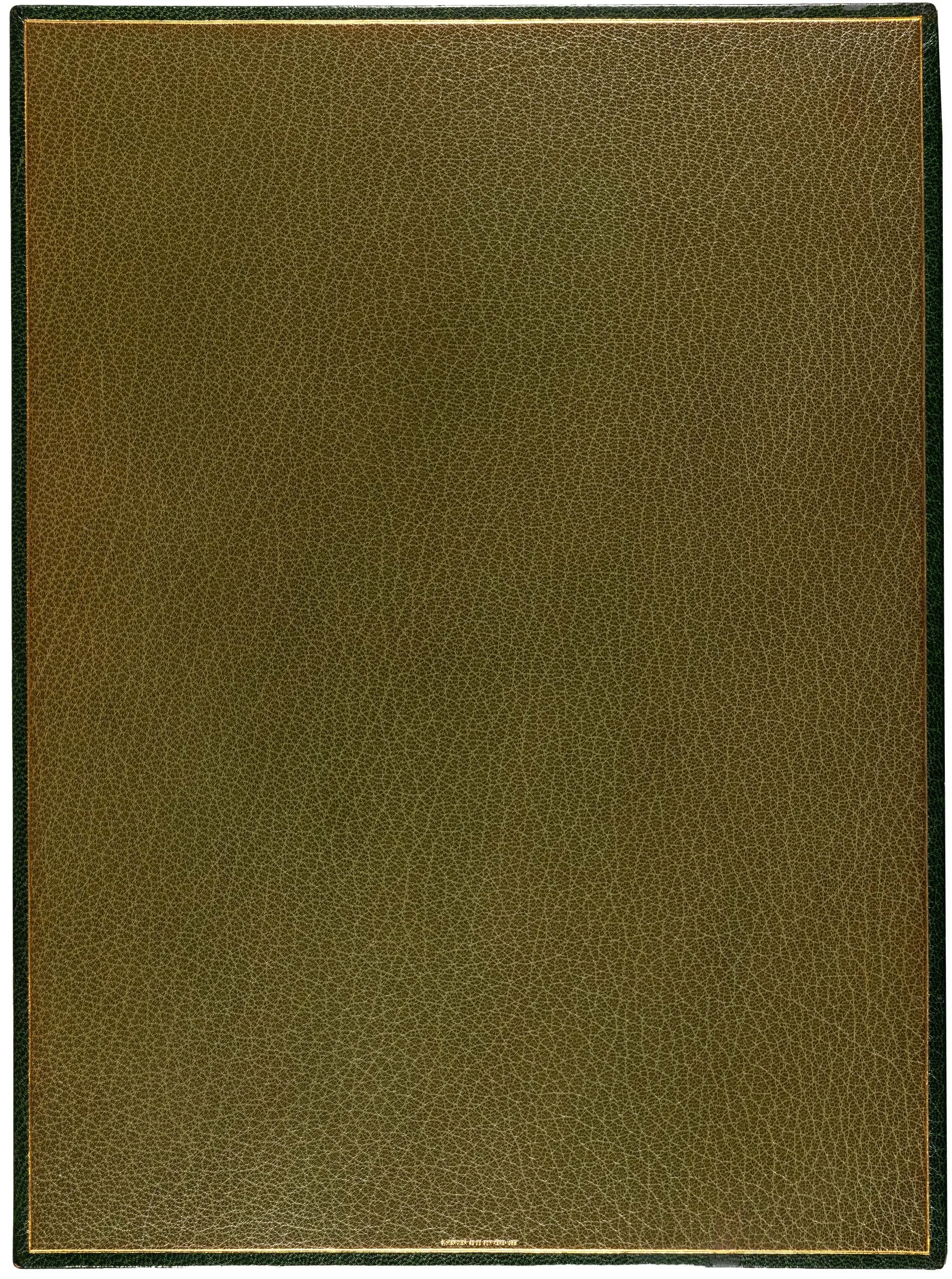
One of only six copies of the absolute deluxe edition, printed on magnificent, sturdy, snow-white parchment—this famous edition from the Cranach Press, described by many connoisseurs as “the most beautiful book printed in Germany in the 20th century,” is presented here in a copy featuring four additional suites of Maillol’s timeless woodcuts, exquisitely and masterfully bound by Georges Mercier in dark green morocco and in mint condition.
Virgil. Les Églogues de Virgile. Texte original et traduction nouvelle par Marc Lafargue / imprimée par Harry de Kessler. Bois dessinés et exécutés par Aristide Maillol.
Weimar, Cranach Presse, 1916-1926.
Large quarto (approx. 320 × 240 mm).
110 leaves, 3 n. n. leaves.
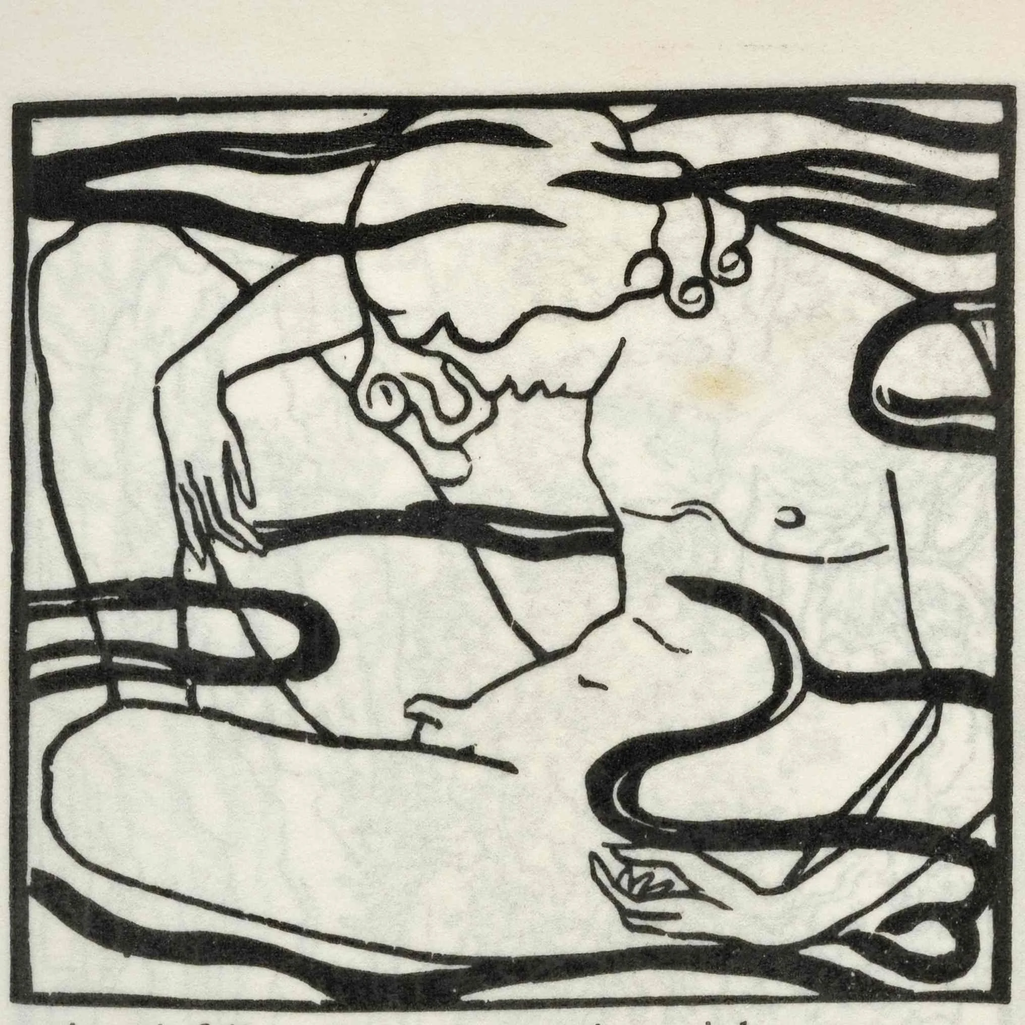
Printed on very strong goatskin parchment. With 43 woodcut engravings by Aristide Maillol, initials designed by Aristide Maillol and cut by Eric Gill, title-page designed by Eric Gill.
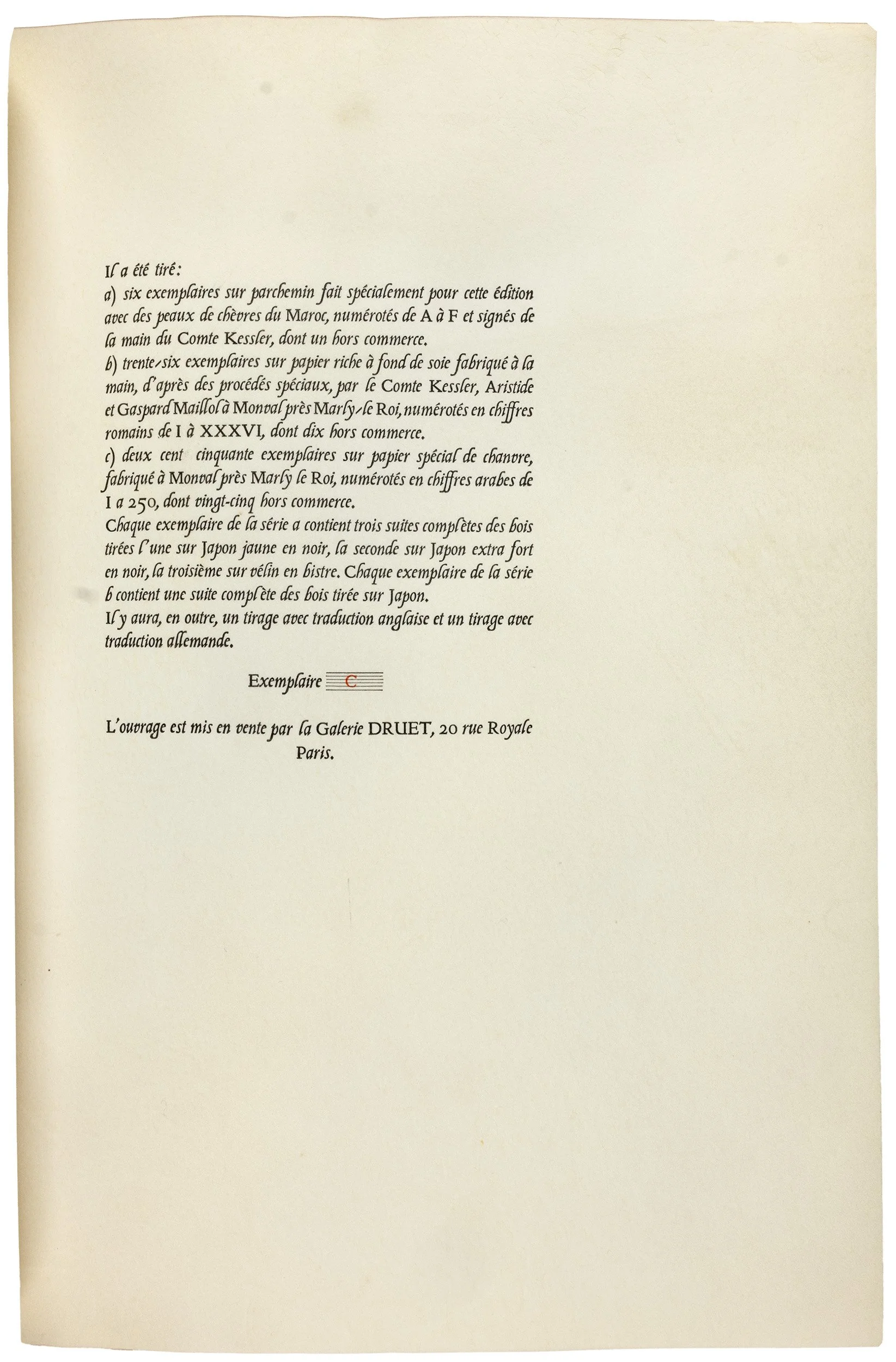
This is one of only six copies of the absolute deluxe edition (“série a”), referred to in the colophon as copies A–F printed on the skin of goats from Morocco. This is copy C.
The additional Suites
The colophon states that each copy in this series would contain three complete sets of Maillol’s woodcuts: in black on yellow Japanese paper, in black on extra-thick Japanese paper, and in bistre on vellum. In reality, this copy was provided with four complete additional sets:
In black on old papier Japon
In black on deep-yellow Japanese paper
In red on China paper
In bistre on vellum (= calfskin).
The Binding
Dark green Morocco binding (“maroquin ecrasé”) with gilt title on the spine and olive-green morocco doublures, signed “Georges Mercier, 1932”. The cardboard slipcase is covered with green marbled paper, which is also featured on the flyleaves.
The Significance
There are a few books that have attained the status of a legend—this is one of them. Connoisseurs call it the most beautiful book printed in Germany in the 20th century.
Virgil’s Éclogues, published by the Cranach Press in 1926 in three languages (French, English and German), was the product of the vision of one of the most dazzling figures of that era. The Anglo-German patron, art collector, author, and diplomat Count Harry Kessler. Highly educated in the humanities, there was no question in his mind that the first work to be published by the private press he founded should be Virgil’s pastoral poems. As early as 1905, Kessler wrote in his diary:
“The book illustration should spring from the type, its black and white tonal effect, and not tear white holes or make black smears in the even color of the text. It should therefore be principally linear as the type is made up of lines. The thickness and thinness of the lines in the illustration should remain within the bounds of the thick and thin strokes of the letters, and the lines should, as much as possible, be distributed in the white of the picture plane as in the letters are in the white of the page, so that there should not be larger white spaces in the picture area than in the text block.” (Müller-Krumbach, p. 49)
Kessler had his vision, but to realize it, he needed an artist capable of bringing it to life. He found his artist in a farmer’s son from the Côte d’Azur. Aristide Maillol had already tried his hand at various arts and crafts and had just turned to sculpture when he met the man who would become his greatest admirer and patron. Kessler took Maillol to Greece, where the artist came to understand the essence of his own art. He recognized that the spirit of antiquity had remained alive in the bodies and gestures, movements, and postures of ordinary people. Yet Kessler demanded a great deal from the artist, as he was to work in a craft with which he had absolutely no experience: the woodcut. Of course, it had to be the woodcut—the oldest and most primordial of all graphic printing techniques.
At the Leipzig Book Fair in 1914 trial cuts for the edition were shown. The war and its aftermath delayed the work for a long time. But in 1925, the work was finally to be completed. Kessler felt compelled to keep an eye on his artist; during his visit to Maillol, he noted in his diary:
“In the afternoon he carved the small fleeing kid for the second Eclogue. Primitiveness of his tools. No tracing paper for tracing, but just ordinary paper which he holds against the window pane. The tracing is done with the tip of his wife’s scissors which were lying around. As he cut he constantly complained that he had no sharp knife and had to work with a broken-off chisel. He made the trial proofs by blacking the cuts with an old cork, laying the paper down and rubbing back and forth with a fork.” (pp. 46-47).
Elsewhere he notes about the artist, who was at times stubborn and headstrong:
“It’s terrible to assign a workload to a genius as if he were a schoolboy.”
But the result speaks for itself: Maillol’s woodcuts transcends time. In his clear and simple outlines lies all the grace of the ancient era in which Virgil’s verses were composed. Kessler writes about him: “Added to this was the fact that Maillol himself is a poet, even if his poetry is expressed not in words but in stone and clay, through proportions and lines.”
The initials, too, contribute to the overall effect of this masterpiece of modern bibliophilia. Kessler writes on this subject:
“Maillol painted the ornaments with his small fine Japanese brush in white on the woodblock. Little by little I brought him the whole alphabet to decorate. Around four, after two hours, all twenty-six letters were finished. He invented for each letter a different ornament, therefore he needed for each letter only five minutes for invention and execution, a hardly believable rate of work. He enjoined me that (Eric) Gill should cut (he did not cut his alphabet himself because his eyes were not up to such close work) but certainly not try to imitate the irregularities of the brush strokes bur rather cut even and uniformly.”
The fourth member of the so-called “brilliant quartet” included Emery Walker, who created the ravishingly beautiful typeface modeled on Nicolaus Jenson’s early 15th-century Venetian print type. Through countless trials, Kessler refined the final typesetting. We must also mention Aristides' nephew, Gaspard Maillol, who set out to find the finest materials to create exquisite paper at a paper mill in Monval. Aristide Maillol was very aware of the importance of choosing the right paper:
“Somebody or other reproached me, that I make naive woodcuts, whereas Vergil is not at all naive, but, rather, elegant, refined. But I wasn’t at all trying to do the same thing as Vergil. Who could imitate Vergil? Then one would have to invent a special illustration for every author? I was trying to make something lovely, something that would fit well with the typography. And I didn’t try to copy Vergil. I did not illustrate Vergil, I illustrated the paper. And for that one first needs beautiful paper. Whether it’s a book for king’s, for student’s or for whores, the first thing one needs is beautiful paper.”
And indeed, this edition has one distinguishing feature (among many other merits) that is lacking in many artist’s books from later decades: the artist’s willingness not to impose his own stamp on the work, but rather to almost subordinate himself to the work as a whole and to serve it with his unique talent.
After eighteen years Kessler couldn’t bear any more delay and in the end, the work had to be rushed. Perhaps too much of a rush for Maillol, who apparently did not get to see the final proofs. When he was shown the book, he commented:
“I made the woodcuts for the Eclogues in such a way that, together with the text, they would fill the page and leave no empty spaces. And he (Kessler) made empty spaces everywhere. He printed the book without informing me, because he knw I would not agree”. (p.48)
Indeed, there are empty spaces o three openings. But to the observer 100 years on, this flaw does nothing to detract from the overwhelming beauty of this edition. Perhaps it serves rather to remind us of the almost superhuman achievement and perseverance of the men who gave us this enduring treasure.
Condition
In mint condition in an elegant, masterfully crafted binding by Georges Mercier.
Meet the Protagonists of this Edition:
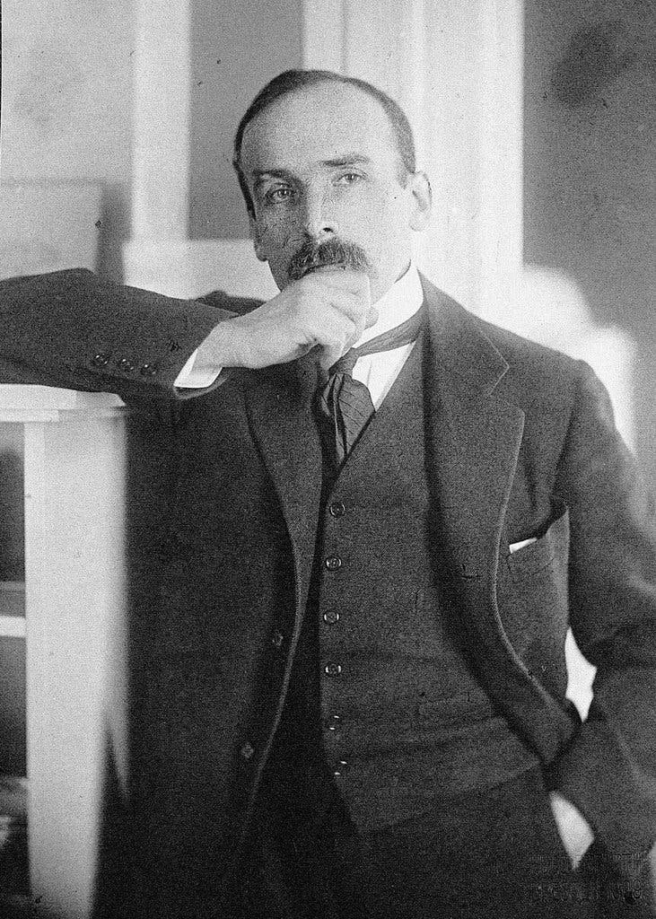
Count Harry Kessler, the driving force and financier behind the legendary Cranach Press Virgil.
Count Harry von Kessler (1868–1937)
Role: Visionary, Patron, and Financier of the Cranach Press
Life & Historical Significance: Count Harry Kessler was the embodiment of a cosmopolitan European aristocrat. Born in Paris in 1868 to a German-Swiss banker and an Irish mother, he was educated across France, England, and Germany, a background that fostered his internationalist outlook . He is widely considered one of the most ardent champions of aesthetic modernism in pre-war Germany .
As a patron, he was instrumental in promoting avant-garde artists, including the sculptor Aristide Maillol, architect Henry van de Velde, and theatre designer Gordon Craig . He served as the director of the Museum of Arts and Crafts in Weimar, where he sought to create a cultural revival.
Following World War I, Kessler underwent a profound political transformation from aristocrat to a committed pacifist and internationalist, aligning himself with the Social Democrats and earning the nickname “the Red Count” . This shift forced him into exile when the Nazis seized power in 1933, and he died in France in 1937 . In addition to his manifold achievements, Kessler was an obsessive diarist whose writings offer an unparalleled view into European society and politics . He lived his life openly as a homosexual, a notable fact for a man in his societal position at the time . W.H. Auden famously called him "a crown witness of our times".
Key Significance for the Virgil Edition: Kessler was the visionary and producer of this Gesamtkunstwerk. He conceived the project, financed every detail of its lavish production, and meticulously oversaw the selection of the paper, typefaces, and especially the artist, Aristide Maillol. His relentless drive to achieve perfection was the sole reason this masterpiece was realized despite the immense disruptions of the First World War .
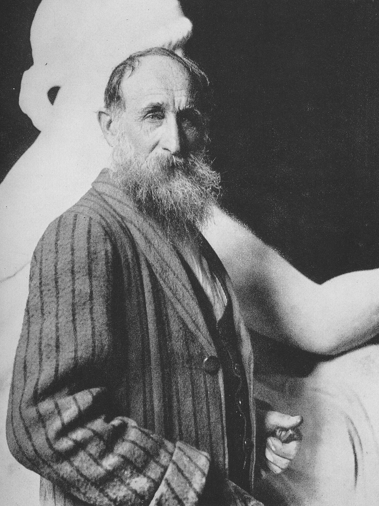
Aristide Maillol, the sculptor and woodcut artist behind the Cranach Press Virgil.
Aristide Maillol (1861–1944)
Role: Artist and Illustrator (Woodcuts)
Life & Historical Significance: Aristide Maillol was a French sculptor, painter, and printmaker, and one of the most celebrated sculptors of his time. Born in Banyuls-sur-Mer, he moved to Paris in 1881 to study painting at the École des Beaux-Arts, where he was influenced by Puvis de Chavannes and Gauguin. He briefly revived the tapestry art form in France before a deteriorating eye condition led him to devote himself fully to sculpture around 1900.
His breakthrough came with La Méditerranée (1905), which rejected Rodin's emotionalism in favor of classical simplicity, harmony, and stability. Nearly all his mature work focused on the female form, stripped of literary associations—pioneering a concept of sculpture in the round that influenced later modernists including Henry Moore.
In 1908, Count Kessler took Maillol to Greece, a journey that profoundly shaped his artistic sensibility. Despite having no prior experience with woodcuts, Kessler commissioned him to illustrate Virgil's Eclogues—a project on which Maillol worked intermittently for 13 years, creating 43 woodcuts of extraordinary economy and grace.
Key Significance for the Virgil Edition: Maillol was the artist who brought Kessler's vision to life. His 43 woodcuts—simple, clear, and timeless—reflect both the spirit of antiquity and the grace of ordinary Mediterranean life, a quality Kessler recognized during their journey to Greece.
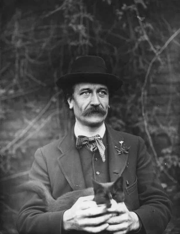
Sir Emery Walker, the master printer and typographer who supervised the type for the Cranach Press Virgil.
Sir Emery Walker (1851–1933)
Role: Typographer and Typeface Supervisor
Life & Historical Significance: Sir Emery Walker was an English engraver, photographer, and printer who played a pivotal role in the revival of fine printing in the late 19th and early 20th centuries . Born in London, his formal schooling ended at age 13 when he had to support his family after his father lost his sight . He developed a profound understanding of printing history during his decade at the Typographic Etching Company.
Walker befriended William Morris in the late 1870s, sharing both socialist beliefs and a passion for printing. A talk he gave in 1888 inspired Morris to establish the Kelmscott Press, considered the beginning of the private press movement in England . In 1900, Walker co-founded the Doves Press with T. J. Cobden-Sanderson, creating the celebrated Doves Roman type based on Nicolas Jenson's 15th-century Venetian model.
Walker was engaged by Count Harry Kessler to supervise the creation of the type for the Cranach Press in Weimar . The punches were cut by the highly-regarded Edward Prince, with the roman type modelled on Jenson's 1470 design and the italic based on the work of the Renaissance calligrapher Tagliente . He was knighted in 1930 for his services to printing and died in London in 1933.
Key Significance for the Virgil Edition
Walker was the typographical authority who ensured the Cranach Press Virgil met the highest standards of the private press movement. He brought decades of expertise from his work with Morris and the Doves Press, overseeing the cutting of the roman and italic types that give the edition its timeless elegance. The type was executed under his supervision by Edward Prince, one of the finest punchcutters of the era
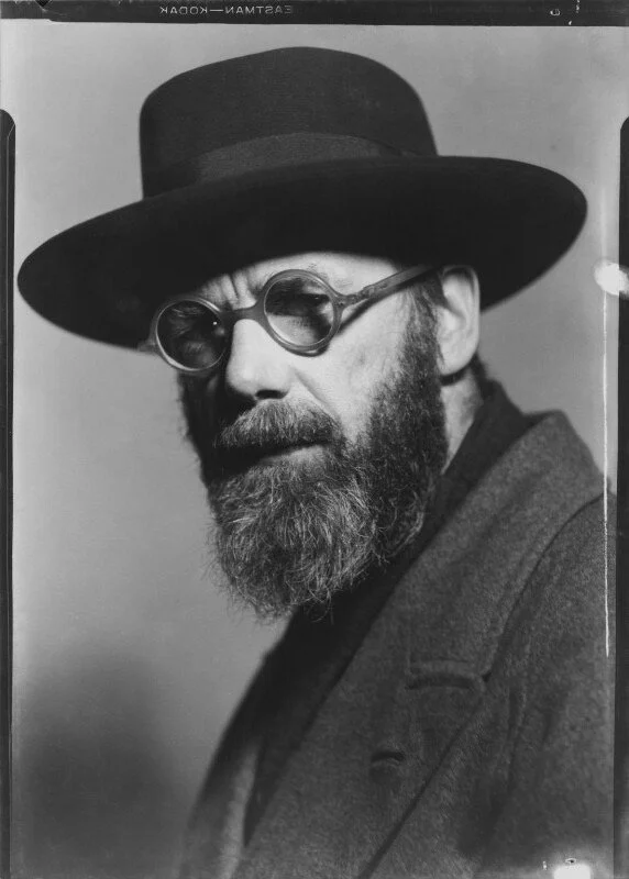
Eric Gill, the sculptor and typographer who designed the title page and lettering for the Cranach Press Virgil.
Eric Gill (1882–1940)
Role: Title Page and Lettering Designer
Life & Historical Significance: Arthur Eric Rowton Gill was an English sculptor, letter cutter, typeface designer, and printmaker—one of the most versatile and influential artist-craftsmen of the 20th century . Born in Brighton, he trained as an architect before turning to letter carving under the influence of Edward Johnston, a pioneer in the revival of calligraphy . He became a sculptor of considerable renown, creating the celebrated Stations of the Cross for Westminster Cathedral (1914–18) and major public commissions including the relief Prospero and Ariel on Broadcasting House in London .
Gill designed several enduring typefaces—Perpetua (1925), Gill Sans (1927), and Joanna (1930)—which remain among the most beautiful and widely used typefaces in the world . He was also a prolific wood engraver and book illustrator, working for private presses including the Golden Cockerel Press, for which he designed and illustrated The Four Gospels (1931) using type he created expressly for the edition . A controversial and provocative writer on art, religion, and society, Gill converted to Roman Catholicism in 1913 and established craft communities that emphasized manual labour and religious devotion.
Key Significance for the Virgil Edition:
Gill was responsible for the title page design, the headline lettering, and all the initial letters (white on black) for the Cranach Press Eclogues. He cut the headline for the title page of the German edition in 1914 and later cut the English edition's headline in 1927. His elegant lettering complements Maillol's woodcuts and Walker's typography, making him the fourth member of the "brilliant quartet" that brought this masterpiece to life.
Bibliography
Müller-Krumbach 40 (featuring numerous reproductions). Eyssen, Buchkunst in Deutschland S. 94. Rewald, The Woodcuts of Maillol 8-53. Artist and the Book 172. Evan Gill, no. 328. Schauer. Deutsche Buchkunst 1890-1960. 89ff. Art of the Printed Book, p. 38 and plate 110. Ransom 163.
If you would like to receive further information on this work, please contact us.